Author: Anushka Bhanot

  • BREAKING CHARACTER — 08/10/25


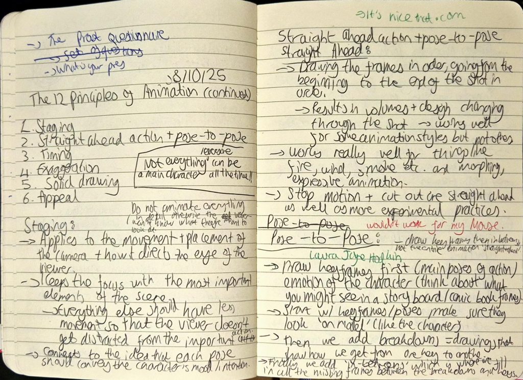
    We learned the last 6 principles of animation, which were:

    1. Staging: Applies to the placement and movement of the camera and how it engages the viewer, keeping the focus on key elements of a scene.
      • E.g. if showing a cafeteria, focus the main characters eating rather than the background characters moving around.
    2. Straight ahead/pose-to-pose:
      • Straight ahead: used in more experimental practices. Is the process of drawing each frame in order, which results in the volume of the object/character changing.
        • E.g. animating fire.
      • Pose-to-pose: used in character animation. Is the process of drawing the keyframes (main poses of action) first and making sure they look exactly like the character, before moving onto breakdowns and then in-betweens.
        • E.g. animating a human character.
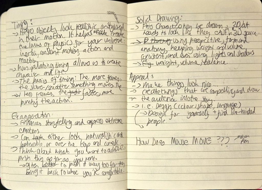
    3. Timing: Helps objects look more realistic/stylised depending on what the intentions are with the animation. Linked with ease in/ease out to an extent, as it describes how more frames = slower/softer timing, less frames = faster/more abrupt timing.
    4. Exaggeration: Enhances storytelling and is used to express extreme emotions. Less exaggeration = more realism, more exaggeration = more stylised.
    5. Solid drawing: The idea that characters need to be drawn in 2D but appear as though they exist within a 3D space.
      • This involves using design techniques such as line, form, anatomy, volume, weight, light etc.
    6. Appeal: A character must be made to look compelling enough to draw the audience into the story.
      • This can be achieved through design (colour, shape, language etc.).

    My notes

    The activities we did to explain staging and exaggeration were really fun to participate in.

    For staging, Jess told us to get into large groups of 2 and create a tableau that we’d show to the other group and vice versa. These tableaus would allow us to see how we can use secondary actions to support the main action without being too distracting. Our group came up with a fight scene, with Berni and I fighting and everyone else watching and filming.

    For exaggeration, we had to individually come up with the loudest and most exaggerated yawn, and also the most subtle yawn that still looks like said action.

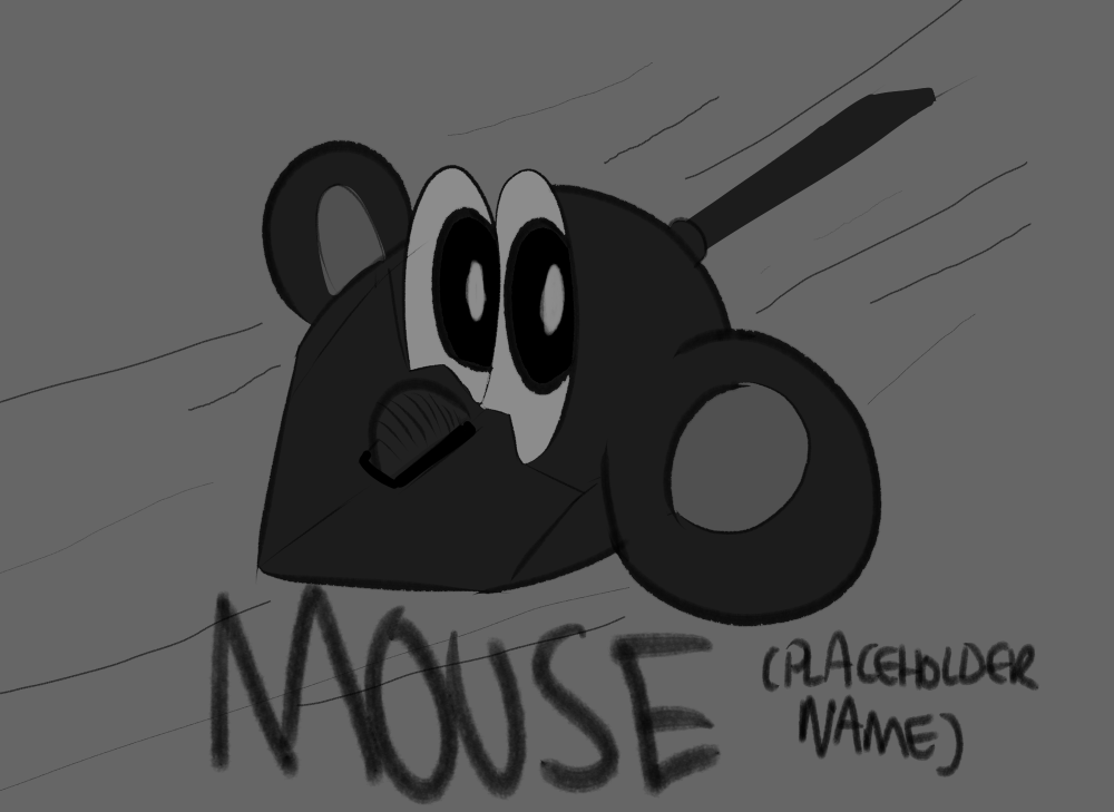
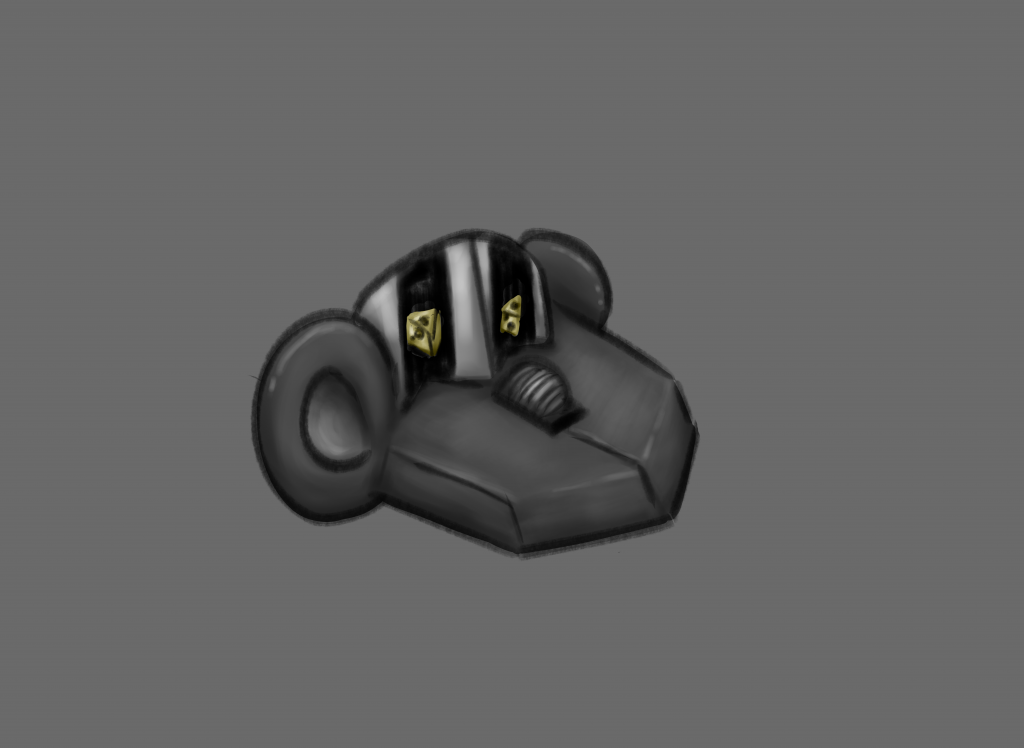
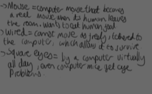
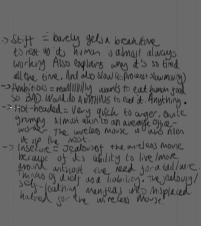
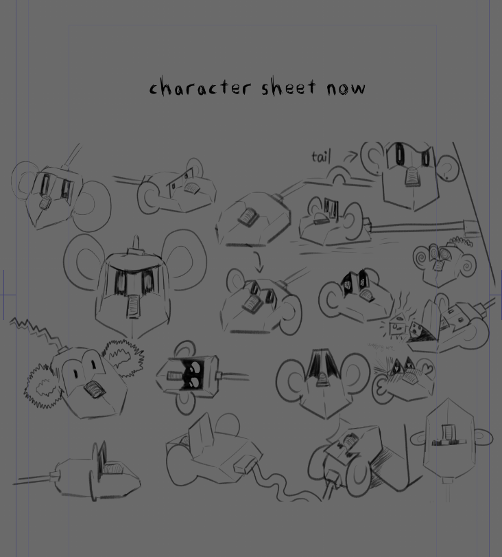
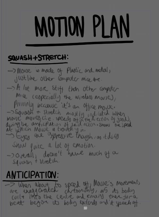
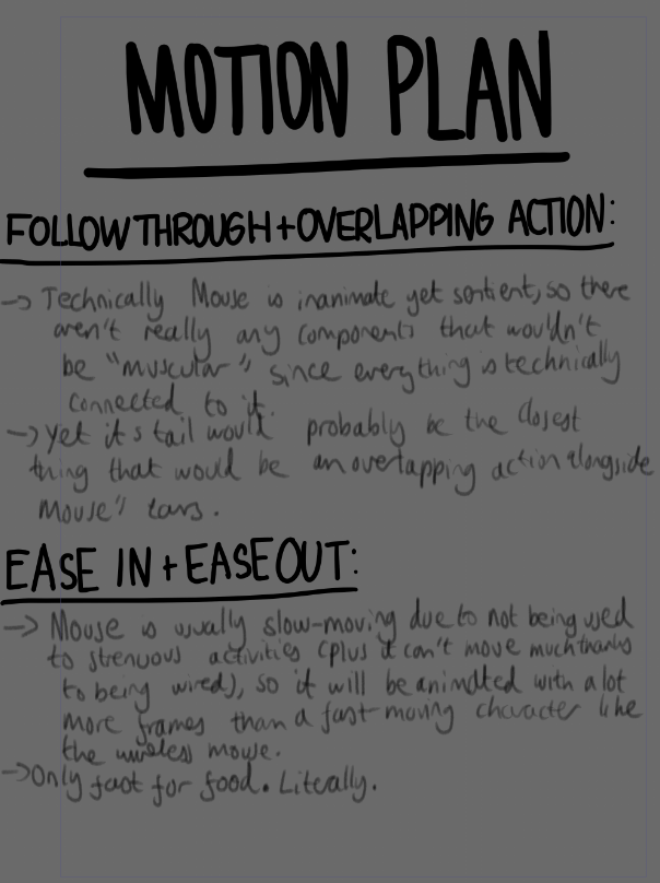
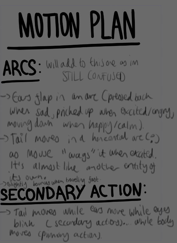
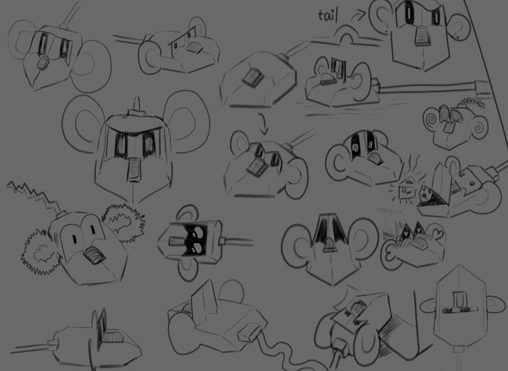
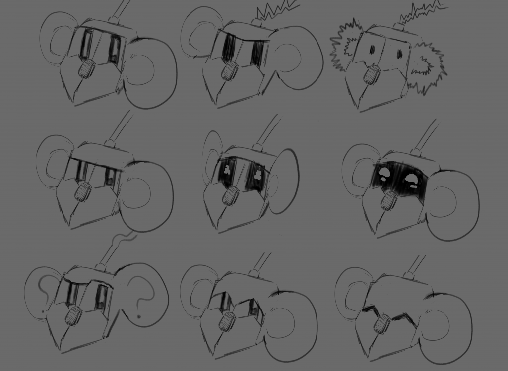
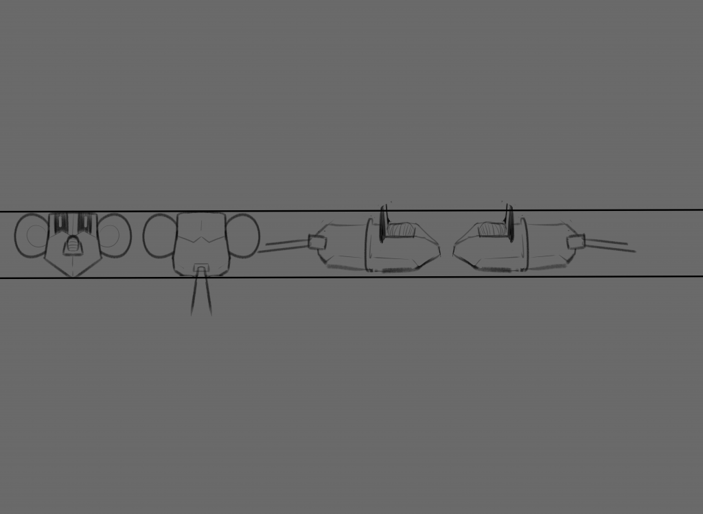
    Since the overall assignment (including the motion plan) involves creating a triptych from the original character experimentations that we did last week (alongside the character sheet, expression sheet and character turnarounds) I also asked Jess whether we could include additional information about our character’s personality and the original character designs I made alongside some physical characteristics, and she said we could. Therefore, on Thursday I finished my motion plan of Mouse, which is shown below:

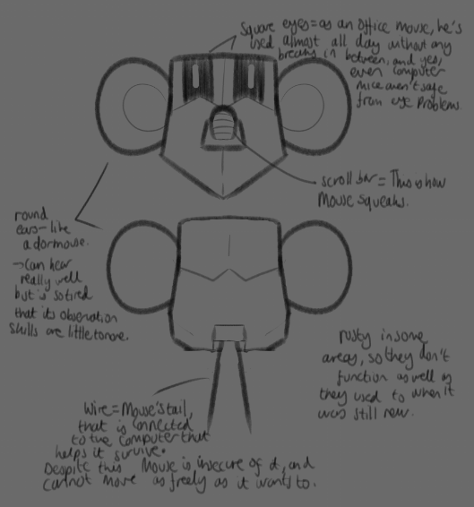
    I didn’t end up writing notes for each principle because it was so difficult to think about how each one would be used in Mouse’s design and movements, and so I merely discussed 9 out of 12 of them, with visual evidence for squash and stretch and exaggeration.


  • BREAKING CHARACTER — 06/10/25


    On this day Jess taught us about 6 of the 12 principles of animation, and gave us examples + activities to do to show how they’re applied:

    1. Squash and Stretch: gives the impression of weight and volume (the more squash + stretch, the more plasticity the character has). The mass of the character must stay the same.
      • E.g. when a character jumps, they squash when they reach the point of contact, and stretch just before and after.
    1. Anticipation: The beat before a key action takes place.
      • E.g. when a character is kicking a ball into the goal, they would bring the foot back (anticipation) before leg continues onto the trajectory and then kicks the ball (action).
    2. Follow through + overlapping action:
      • Follow through: when an action stops there are elements (usually those that don’t have muscles but are still an extension of the action/character) that often continue moving after.
      • Overlapping action: when different parts of a character/object move at different times/rates.
      • Examples of both include hair and clothes.
    3. Ease in/ease out
      • When there are more frames at the beginning/end of an action to decelerate the movement, and fewer frames in the middle to accelerate it (makes actions more believable).
      • More ease = for softer movement (e.g. scooching back, typical motor reactions)
      • Less ease = for abrupt movement (e.g. flinch, reflex reactions)
    4. Arcs (I dislike this principle so much)
      • Have every character move in a circular path rather than a straight, lifeless line. Used mostly for “floaty” effects.
      • For some reason, to me this principle is more difficult to describe or give an example for unless it’s the character very literally moving a part of their body in an arc shape. I don’t really know how I can apply this principle to everything.
    5. Secondary action
      • Not to be confused with follow through/overlapping action as it isn’t a part of the character at all. It is usually an entirely different object/character that moves in tandem with the main action/character, adding more life to a scene without detracting anything from it.
      • E.g. a character is cooking. The act of cooking = main action, the ingredients used = secondary action.

    My notes

    Afterwards, we learnt about what motion plans were and how to apply the principles of animation that we were taught so far to examples shown. The intention behind the activity was to enhance how we explain the feeling of the movement to someone who has never seen the animation before (useful during a project/concept pitch) using the 12 principles of animation to do so. This activity was confusing at first as I didn’t understand what to write, and how to use the principles to explain how objects (in this case jelly) move. I did end up writing notes, as shown below (for both the jelly and pigeon examples):

    Jelly motion plan rough notes

    Pigeon motion plan rough notes

    For homework, we had to begin our motion plans and write about how the 6 principles that we’ve learned so far are implemented into the movement and behaviour of our respective characters, using motion references as visual evidence.

    In the meantime, I took one of Mouse’s designs from the character sheet I created and added colour to it to see how it would look. I didn’t use cel shading (It didn’t look good during my first attempt at colouring Mouse, which will be shown below), and ended up using the airbrush and soft eraser tools to create a softer look (that doesn’t detract from the overall materiality of Mouse).

    (Mouse using cel shading before redesign)

    (Mouse using typical soft shading)

    I wanted to use Clip Studio Paint’s comicbook feature to write down my motion plan then copy and paste onto Google Slides, but it ended up taking a while to format so I stuck to just using Google Slides. These were the pages I made up until that point:

    Motion plan Clip Studio Paint


  • BREAKING CHARACTER — 03/10/25


    In this lesson, Jess taught us about the fundamentals of character sheets, expression sheets and character turnarounds.

    Character sheets: used to both communicate personality and depict the movement of the character.

    Expression Sheets: shows character expressing a variety of emotions, helps keep the character acting consistent

    Character turnaround: displays a 360 degree view of the character to keep appearance consistent from all angles. Usually only includes front, back and sides, but can include 3/4 angles as well.

    My notes

    Jess then taught us how to use Photoshop to draw our characters, a software that I’ve only ever used for editing photos back in A-Level Art & Design. I used to find its user interface very complex, and barely knew how to navigate through it without using Google to research something I searched up a hundred times before. But Jess explained how to use every feature so well, and I actually enjoyed drawing my character on Photoshop. I ended up changing his design to make his eyes square (a play on “square eyes”, a saying that people often use when someone spends a lot of time staring at a screen). This fits his character perfectly, as he’s a computer mouse used in the office, and differentiates him more from wireless mouse, who would have rounder eyes akin to Mouse’s original design.

    My character on Photoshop

    I tried adding colour but Photoshop kept glitching, so I had to ask a tech to help me. I ended up moving to another computer but the same error occurred, and so I gave up and decided to just use Clip Studio Paint (my usual software) instead.

    For next week, we were told to start creating character sheets, expression sheets and character sheets of our characters. I finished everything during the weekend, making sure I had as many poses in my character sheet to explore Mouse’s movement, his emotions in the expression sheet (which are more limited because he’s an office mouse that’s been consistently used), and that angle of his was the same height in the turnaround sheet.

    Mouse’s character sheet (updated)

    Mouse’s expression sheet

    Mouse’s turnaround sheet

    I also made a test animation of Mouse from the character turnaround sheet, using a well known meme as the background and adding my own twist at the end for comedic effect.

    PLEASE NOTE: Increasing the volume is advised for a better viewing experience. Annoyingly, the audio isn’t matching up with the video (which wasn’t happening until I uploaded the video for some reason), but enjoy nonetheless.