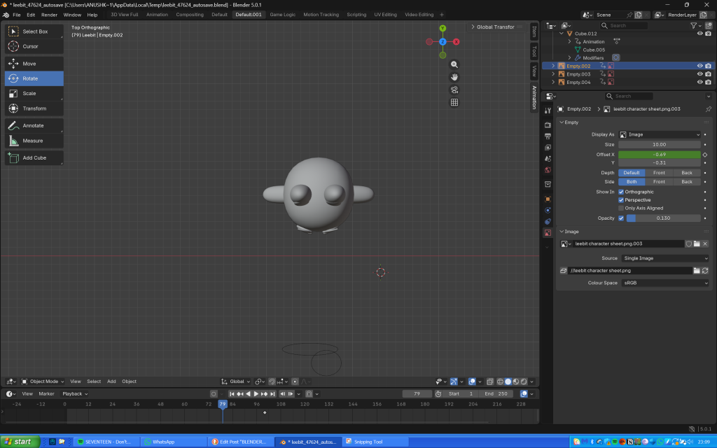
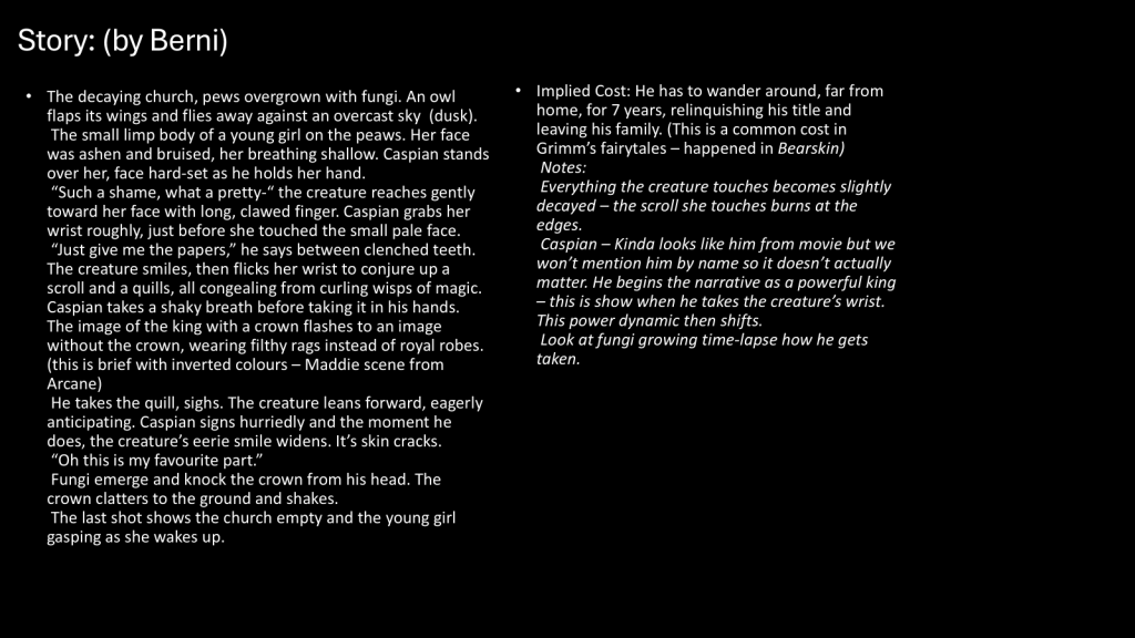
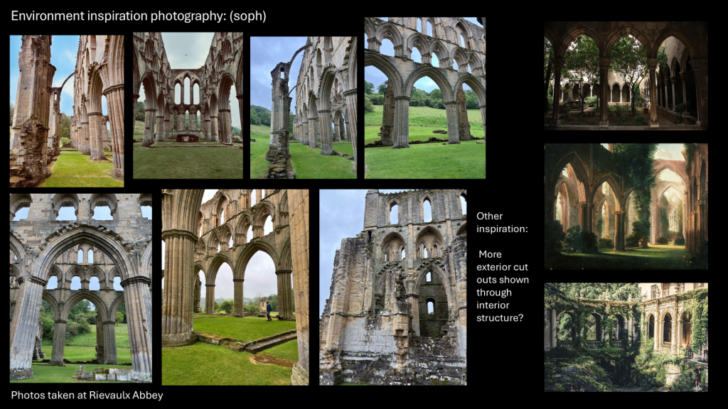
At the beginning of the Christmas holidays, I wanted nothing more than a break from the Out of your Head project. So naturally, I instead decided to conquer Blender.
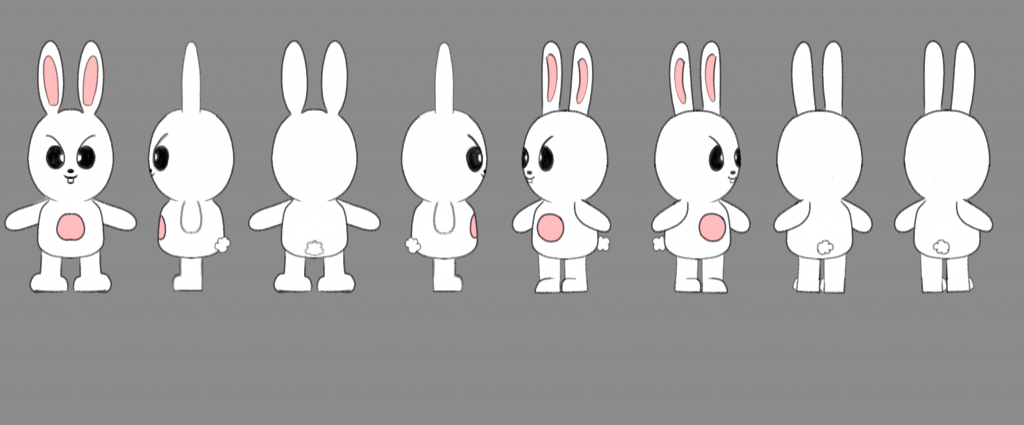
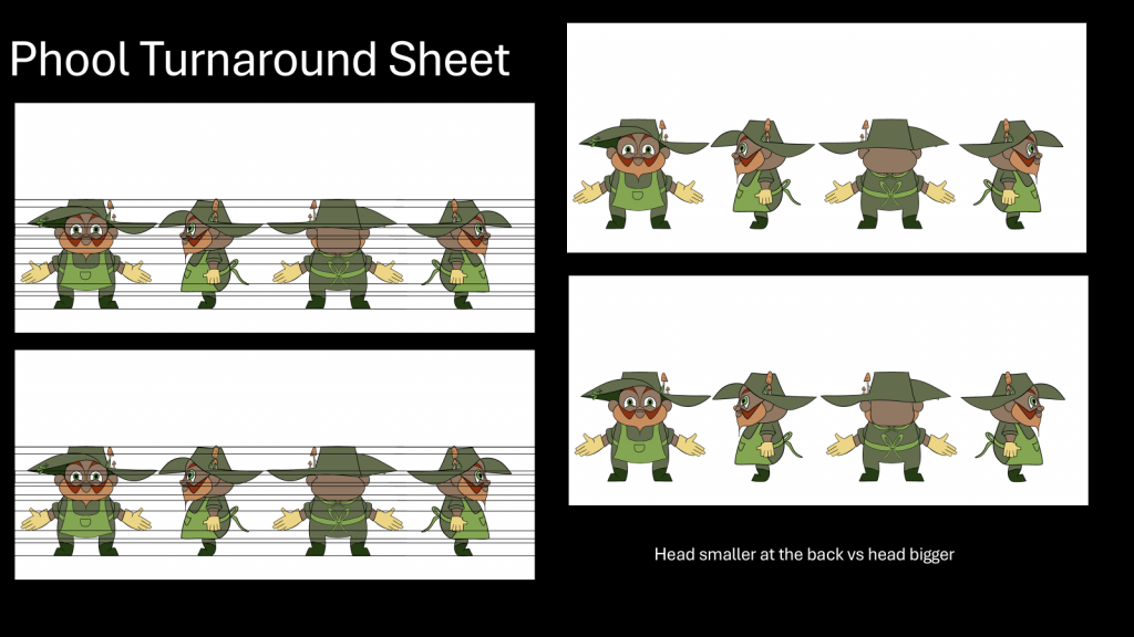
First, I created a character turnaround sheet of the character Leebit from the SKZOO merchandise franchise. He is usually my default option whenever I use a new drawing platform (mostly because he looks so silly, literally no other reason behind this choice).
Leebit’s character turnaround sheet
I watched a tutorial before the Christmas break but didn’t write any notes so I forgot basically everything, which is a great start. My laptop at the time was terrible, so I had to use the extremely old family iMac and download the 2015 version of Blender onto there. The interface looked so overwhelming at first, I really didn’t know how to begin. But I ended up watching a variety of tutorials (I usually don’t watch one because sometimes it doesn’t have what I’m looking for) and tried to get started.
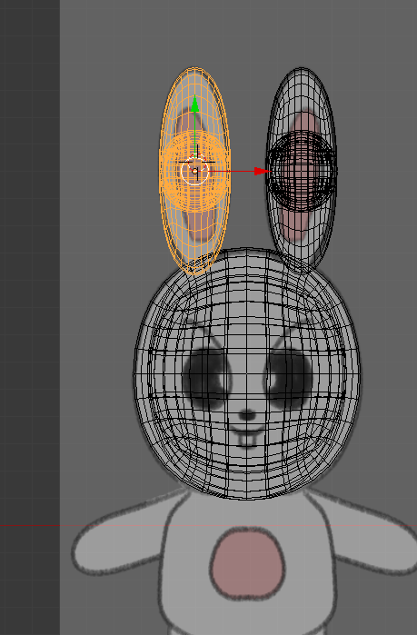
However, I reached some complications when trying to make the ears. Whenever I would extrude the sphere, another sphere would clone within, and I couldn’t delete it or ungroup it from the sphere I was working on. Moreover, there were no tutorials on how to ungroup or delete the duplicated sphere, so I left it as it was (it wasn’t visible unless you went on X-ray mode).
The error I encountered (in X-ray mode)
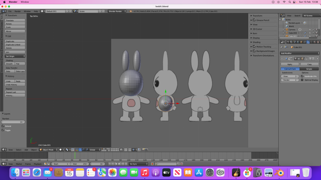
I successfully made the head (using separate spheres), but making the body was extremely difficult and I didn’t know what to search for to aid me, therefore I gave up and stopped working on the project for a while.
My progress before pausing the project
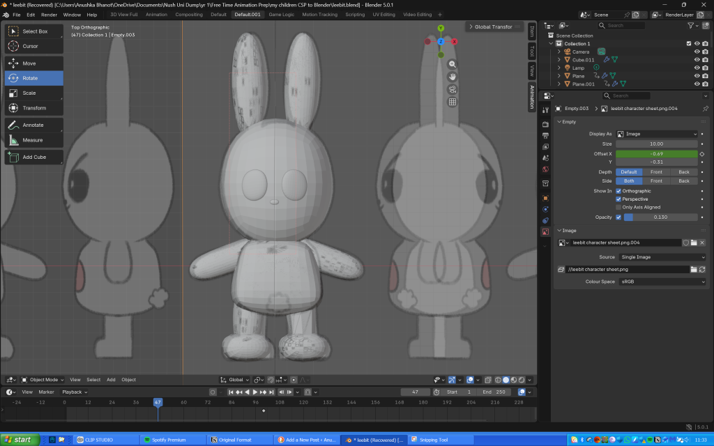
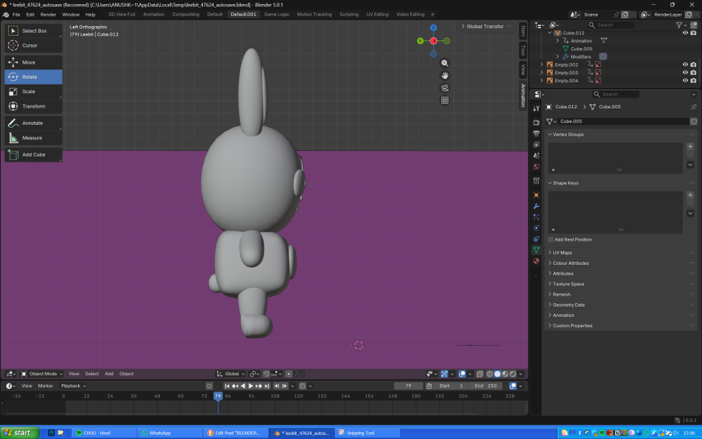
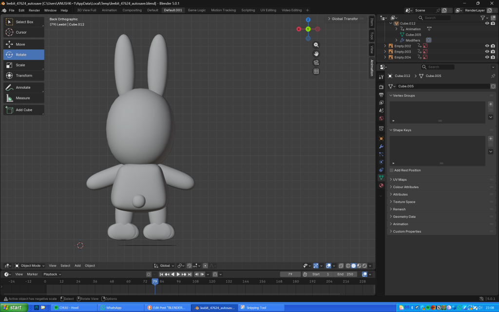
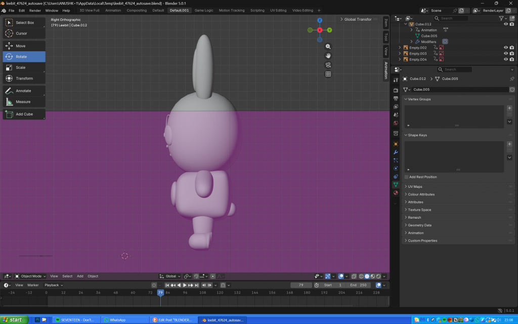
On Saturday (13th February), I downloaded Blender on my new laptop and decided to resume the project. The UI was so much easier to navigate, and I was able to successfully make Leebit’s body, alongside his arms and legs. Making his feet took longer as I didn’t know how to shape them and flatten the bottom, but I somehow managed.
My progress so far
Meanwhile I wrote every command I used since I kept forgetting when I worked on Leebit on the iMac back in December.
My notes
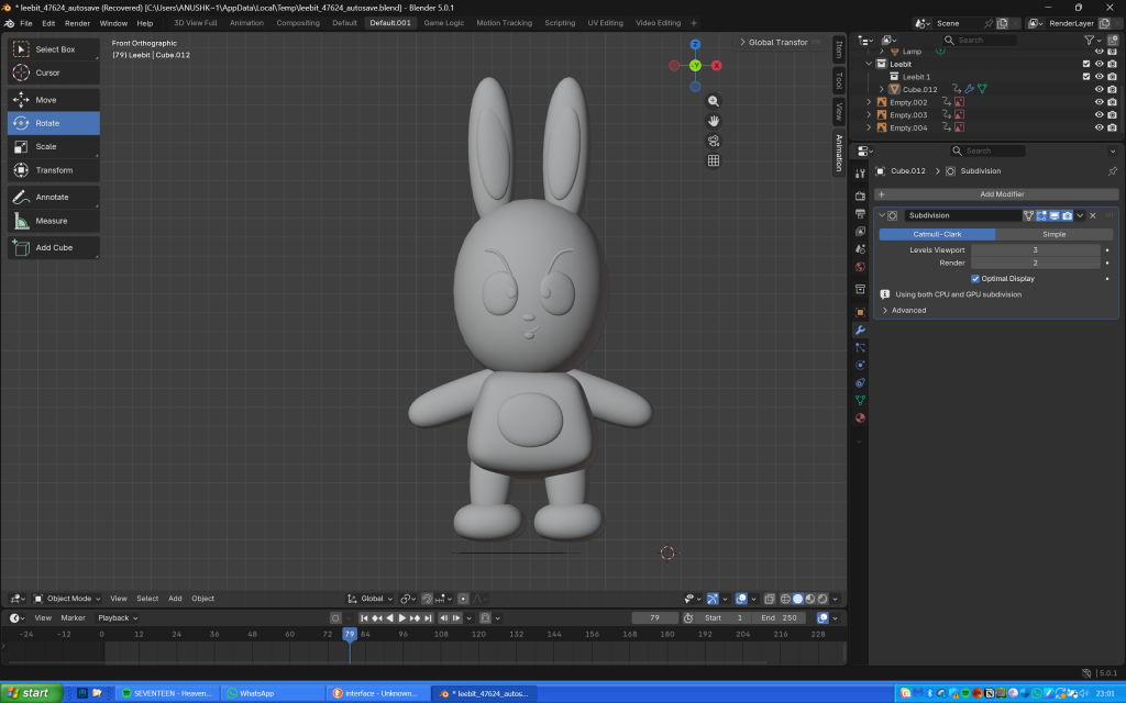
The next day, I used planes to make Leebit’s features (scaling them, making them 3D then shaping them into position), and paths for the antenna looking thing on his eyes (probably an eyelash or eye crease) and his mouth. I didn’t realise that I could make the entire body using just one cube as I ended up using several of them, thinking they would then seamlessly blend together when I used the shade smooth tool.
My progress after finishing shaping Leebit’s features, joining the components and adding the shade smooth tool
Overall he does look slightly misshapen, but I’m so proud of my creation nonetheless as I honestly thought making anything on Blender would be impossible and I wouldn’t be able to do it.
Links to the tutorials I used throughout the project:
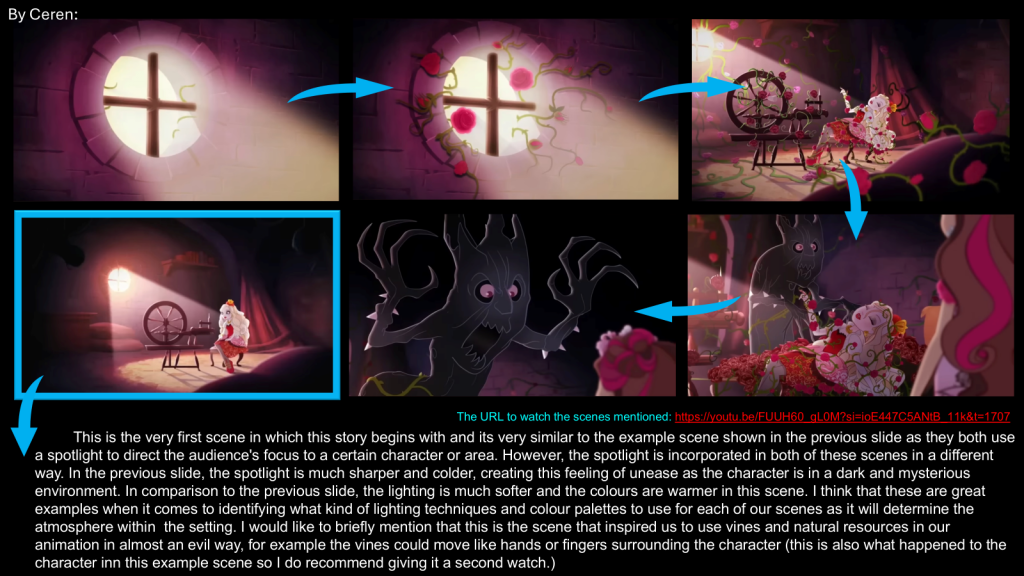
I have split the content from Out of your Head into 3 sections to show the production pipeline and the chronology of how we worked throughout the project:
Planning for the production side of the project began just before the holidays, and we created a task-list of what to do during Christmas break as shown below:
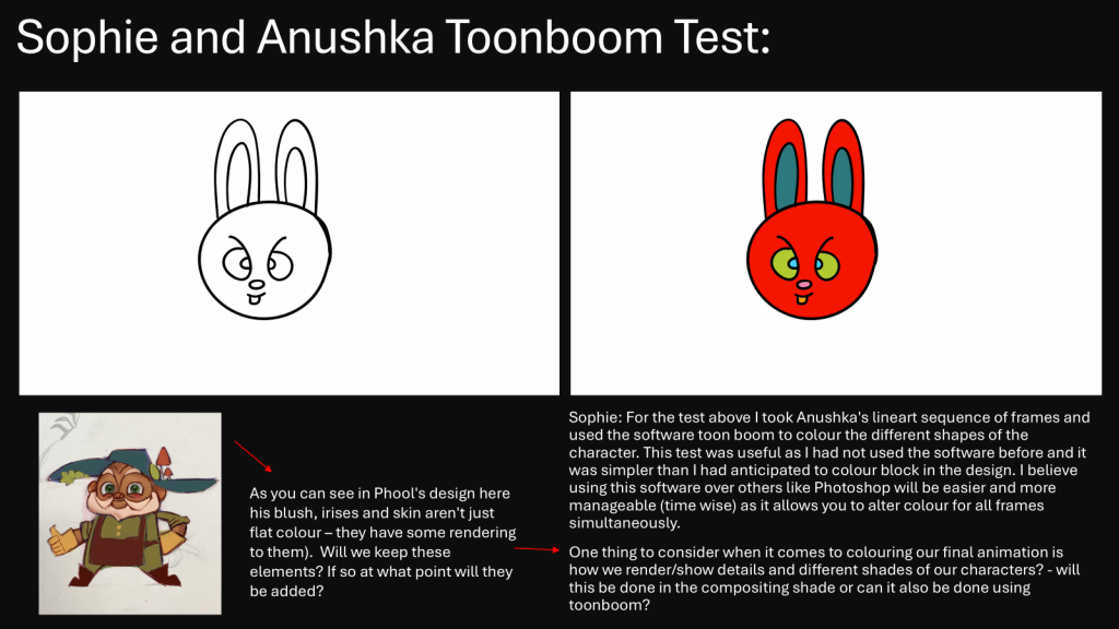
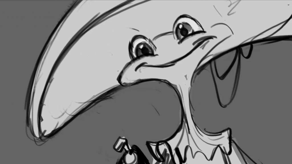
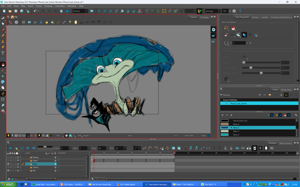
During the holidays, I downloaded ToonBoom Harmony (the software most of us would use for lineart) and watched a tutorial on how to use it, before animating a boil of the character Leebit from the K-Pop franchise SKZOO to send to Sophie to colour.
Lineart test by me.
Colour test by Sophie.
Initially, we had decided that I would lineart and Sophie would colour scenes, however since Sophie had a lot to cover with backgrounds (she designed all of them!) I ended up taking on both lineart and colour (which was honestly more efficient in the long run).
After returning from my holiday, I felt bad as everyone in my group was working so hard, and I wanted to take some of the weight from them and help. Therefore, I got started with animating scene 2 on Toon Boom Harmony.
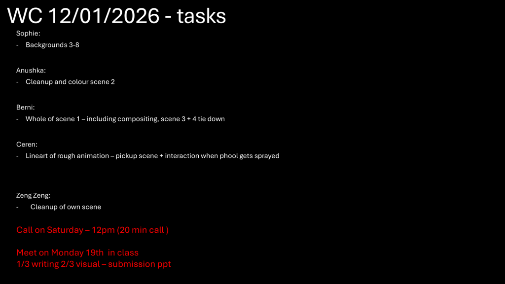
Our tasks during the week we returned to university.
Firstly, I began drawing keyframes (this took me around 2 days to complete), as shown below:
Scene 2 Keyframes. PLEASE NOTE: The video is pixelated and I don’t know how to fix it.
After drawing in the keyframes, I finished in-betweens (which took me another day). I then used the colour palette that Berni collated from her animation of scene 1 and applied it to my own scene (both Phool and the box). Afterwards, I sent the animation to Berni for compositing.
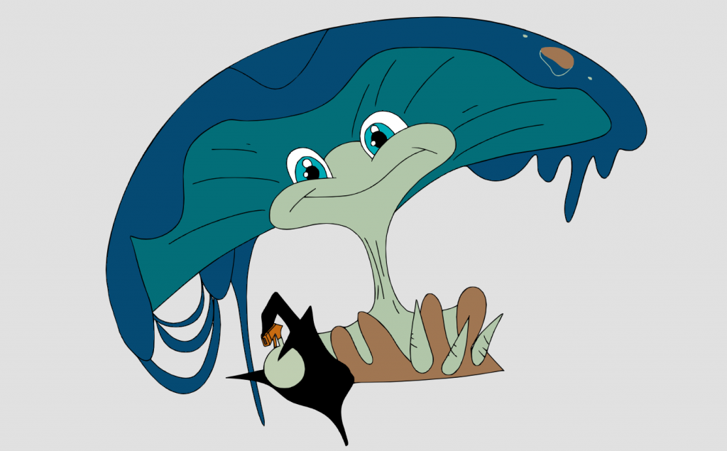
Scene 2 lineart and colour.
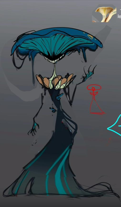
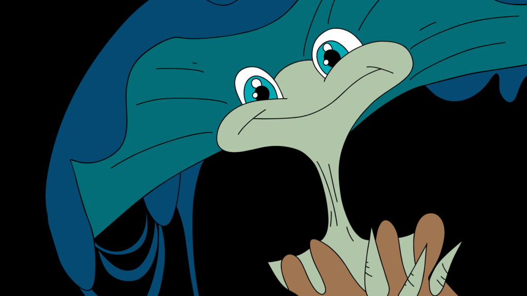
After animating scene 2, I was also given the task to draw scene 10 (rough, lineart and colour). Since we hadn’t actually established the creature’s colour palette, I was told to use the original palette that Zeng Zeng made for the ‘bargain deal’ idea, as shown below:
I began by using the animatic as reference and traced rough outlines of the creature using the same brush size I used for Phool (not realising I should have increased the size since she’s a much larger creature than he is and a thinner brush line would make her look disproportionate).
Scene 10 from the animatic (a still, did not have to be animated)
Rough sketch of the creature with colour swatched in as a test.
Scene 10 coloured
Later on, while comparing our progress with the rest of the group, we realised that there were some inconsistencies with our animations as we relied on the animatic as references (we didn’t have anything else to go by). One of the main ones was that the hand used to spray Phool was meant to be the creature’s right, not her left. I tried to alter it on ToonBoom by flipping the hand, but it ended up looking wrong, and after trying to sketch her right hand for far too long I gave up and removed her hand entirely.
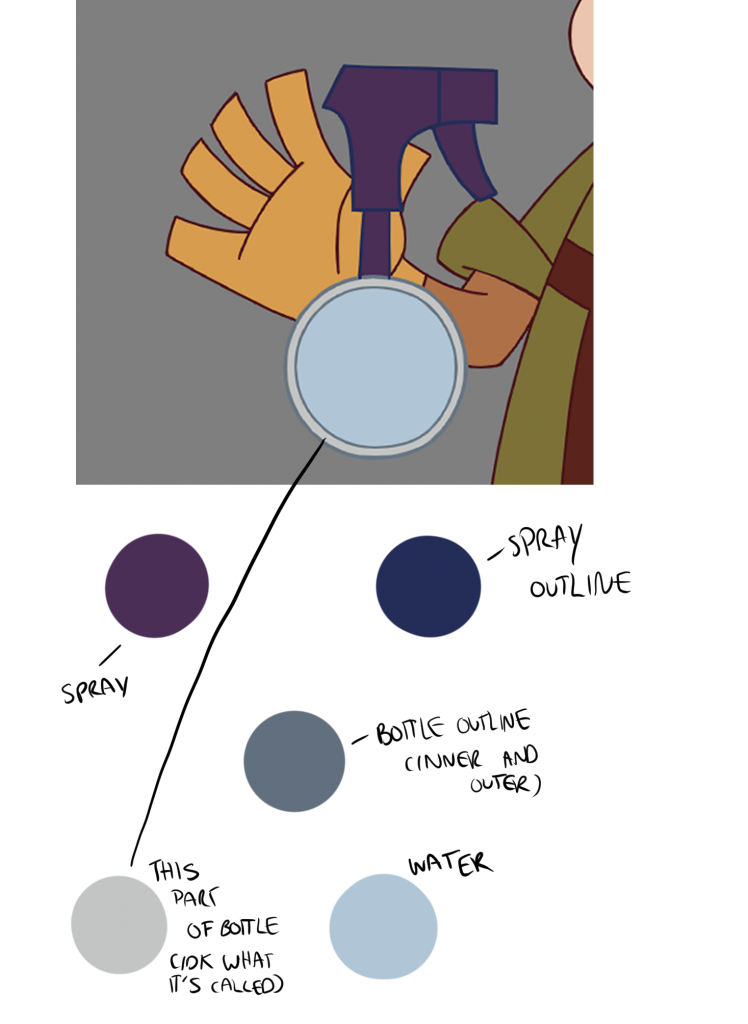
Moreover, we didn’t know what the colour of the spray bottle was, therefore in her scene Zeng Zeng coloured it with a purple nozzle and water inside (light blue). We really liked the design, but Berni wanted the colour changed to reflect the colour palette of the background more, alongside removing the water as it would be more complicated to animate (which was definitely true). The rest of us didn’t agree with the former, and while Berni was adamant to have the colour changed, it didn’t feel significant enough to warrant one, especially since there were already so many more serious inconsistencies such as the hand placement that I discussed above, and we still had our animations to finish. Therefore, we reached a compromise, and retained most of Zeng Zeng’s design while removing the water.
This is what scene 10 looked like after the changes:
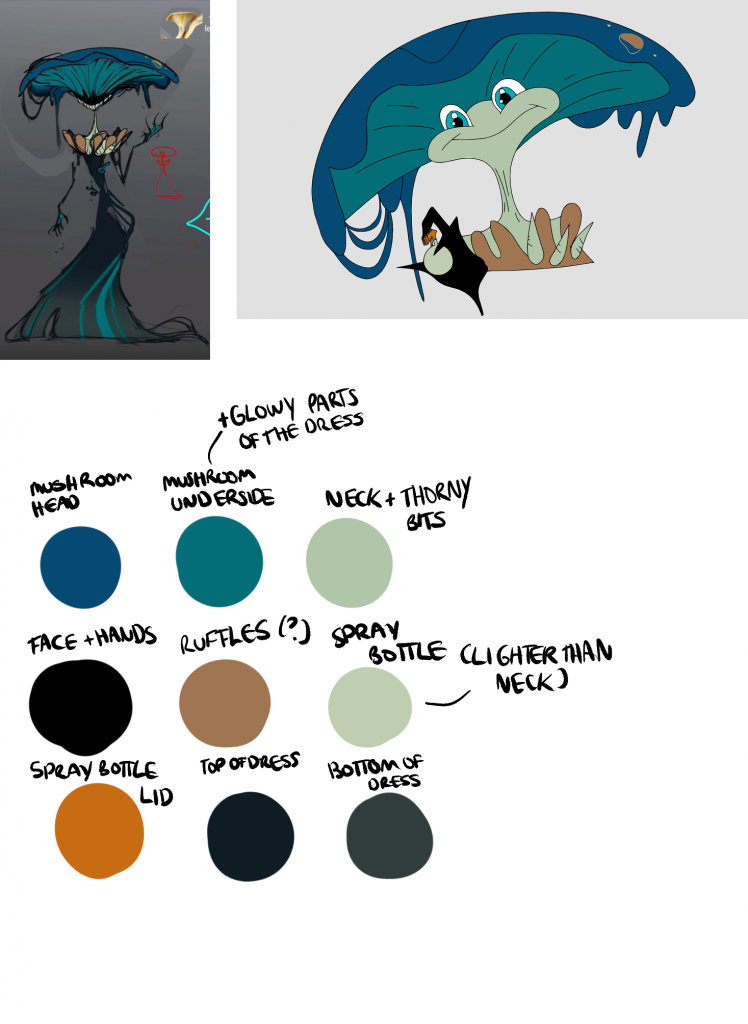
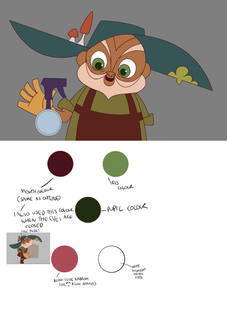
Since a cohesive colour palette was not established, I used my scenes to create one for the group to use. I then updated it later on with features from my later scenes that I wasn’t able to add before, while also adding the new colour palette of the spray bottle.
Original colour palettes for Phool and the creature
Updated colour palette for Phool, including the new design for the spray bottle
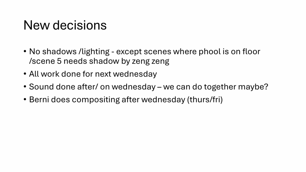
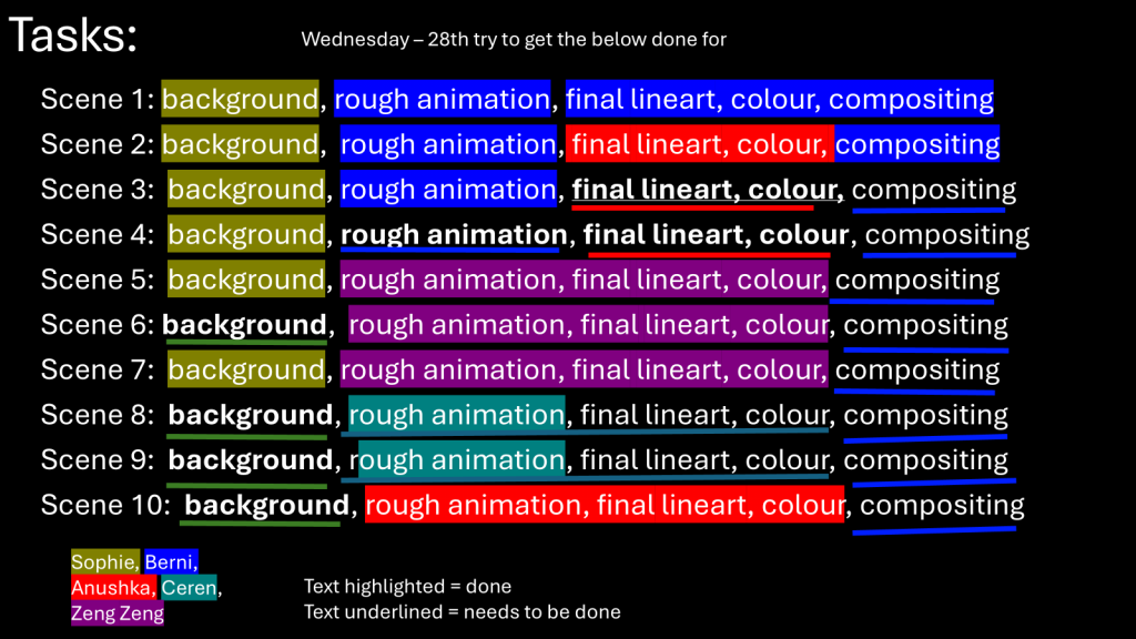
We did encounter a few instances of miscommunication within our group, which was perfectly normal. However, it escalated and essentially exploded a few weeks into the new term, which was necessary yet highly inconvenient. To overcome this, Jess suggested we create a chart where we allocate tasks to each person to be completed by a certain deadline (in our case Wednesday 28th, which was the week after by that point), and colour-code whether the person has finished their task or not. We created an equivalent below:
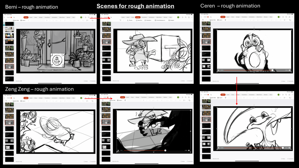
As you can see above, I still had scenes 3 and 4 left to lineart and colour before sending them to Berni for compositing. I was in the process of completing scene 3 at the time, and had to animate each component incrementally before moving onto the next one, hence the various versions shown below. I began with animating the hat since it was the element that I felt the most worried about, so by animating it (alongside the small mushrooms and moss on the hat) first I saved myself a lot of hassle later on.
Scene 3 iteration 1: hat
Scene 3 iteration 2: body
Scene 3 iteration 3: hands and spray
Scene 3 iteration 4: face
Scene 3 iteration 5: colour
Scene 3 iteration 6: blush and highlights
Scene 3 iteration 7: mushroom
Scene 3 iteration 8: water
In regards to scene 3, I was told that if it ever got too much (since I had to take my time with the scene in case inconsistencies arise), someone else could animate scene 4 in my place. It took me almost a week and a half to animate scene 3 due to its sheer intensity and constantly checking for and replacing errors, Therefore, I did end up asking someone if they could animate scene 4 instead.
REFLECTION:
In terms of software, ToonBoom took time to get accustomed to as I was so used to Clip Studio Paint as my preferred program for animation. While I did get used to it after a short while and its user interface became much easier to navigate, I did come across a complication when animating the second scene. For some reason, I had two save files of the same animation, yet only one of them was up to date. Therefore, I clicked ‘save’ and closed both windows before reopening them and checking the file once more. But for some reason, the outdated version was saved instead! I felt extremely panicked because I had finished all of the lineart of Phool by that point, and I genuinely felt as though my life’s work just went down the drain (dramatic I know). Thankfully Berni was there to help and told me that ToonBoom never necessarily deletes work and there’s always a backup somewhere. I ended up finding the lost frames in a backup file and imported them into the scene using the drawing substitutions tab.
Miscommunication became a huge issue in this stage, as whilst we were working on our respective animations, we did need clarity in order to keep everything as consistent as possible. Since we slightly underprepared in the pre-production process, we underestimated just how disruptive this would become to our workload. This was especially in regards to not creating a proper character, expression or height comparison sheet for both Phool and the creature since we assumed we didn’t need them. This impacted my groupmates who merely had the animatic to rely on and were drawing the rough animations from scratch. Therefore when they presented their progress with their respective animations, our groupmate pointed out many details that we never previously established. This led to an array of misunderstandings and a lot of friction within the group that continued despite attempts to resolve it and communicate better.
In general, the production process was exhausting yet highly rewarding. It was good to work on our respective animations in our own time. Whilst lineart was challenging, I learnt so much about how to draw faster and more efficiently, whilst retaining everything laid out in the rough animation. At times I did struggle with consistency, as in scene 2 I relied heavily on the rough animation and ended up drawing the eyebrows with different sizes in each frame! Moreover, I do highly regret not finishing scene 4 by myself, as everyone was burnt out and I should not have used it as an excuse to ask someone else to complete it instead. Next time, I want to handle my workload better and find ways to reduce burnout without procrastinating or offloading my own tasks onto others that are just trying to finish their own. Despite this, I believe I did a good job and was able to replicate the artstyle of the animation to the best of my ability.
I have split the content from Out of your Head into 3 sections to show the production pipeline and the chronology of how we worked throughout the project:
From the very beginning, one of our groupmates had devised a plethora of ideas that we were to then sift through and give our input on which idea we found the best. This gave us a head-start as it was good to have someone who prepared beforehand, and we could then begin brainstorming using the ideas listed.
One of the ideas that my teammate and I found very intriguing was a a concept about a group of girls trying on clothes in a shopping mall amidst a zombie apocalypse. I visualised the animation to first depict the girls trying on outfits and looking cheerful as another girl (possibly the oldest in the group) looks on. She tries to seem positive but her smile thins and she looks out of the window, where we then see the carnage that the apocalypse caused. We ended up scratching the idea because it it was deemed too complex for a 30 second animation, but I do believe this concept has potential and would like to explore it in my own work.
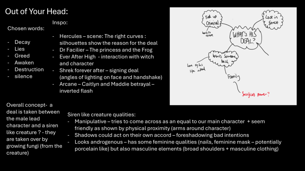
The entire group unanimously choose an idea about a bargain deal between two characters, possibly a noble figure and a creature, in which the former must sacrifice something of theirs in order to secure the deal. We ended up transcribing our ideas for this week onto a PowerPoint, which will be shown below:
Initial roles before they were slightly altered.
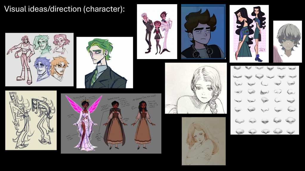
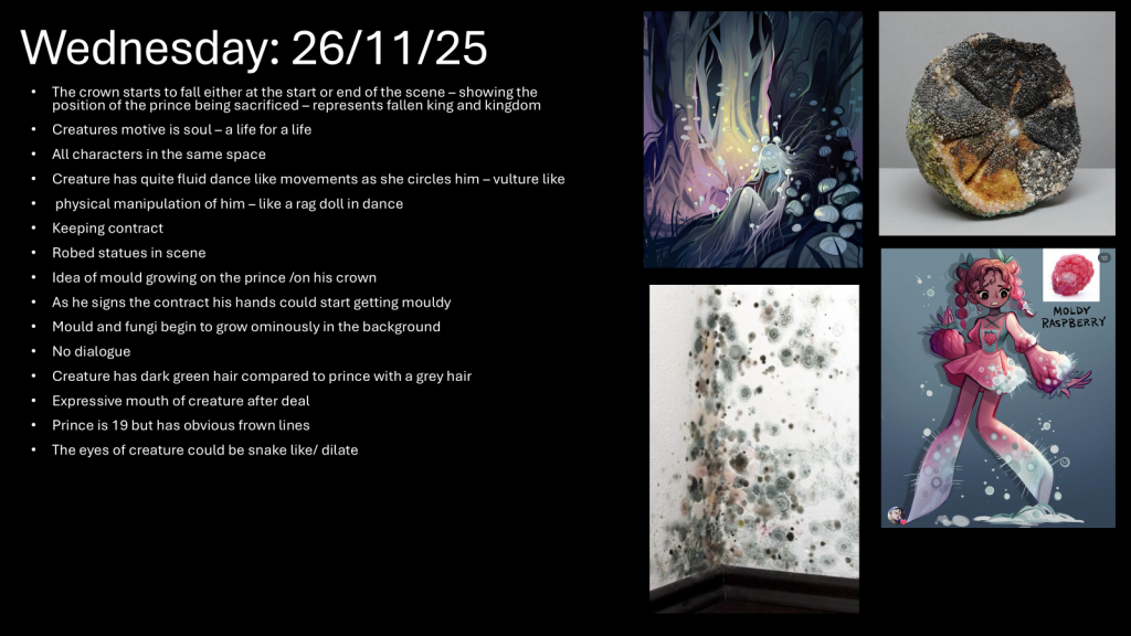
On Monday, we had discussed the creature possibly taking on an androgynous appearance, thus contributing to the ambiguity of the character and their intentions. We discussed their misleading nature and how it is displayed through their appearance: their siren like beauty that appears beguiling at first but turns sinister when they smile, showing cracks that appear around the corners to reflect their true self. I was one of the people assigned to design the character based on what we discussed.
I am very interested in the psychology of an individual and exploring how an individual’s traits are a result of their upbringing and their environment. Usually when designing a character, I use what I was taught in psychology A-Level and apply it to their design and personality, creating a backstory that then explains why the character acts the way they do in the present moment. Additionally, I have always been fascinated by religious connotations and undertones, and when discussing the plot with the group, I felt that this would come in handy when styling the creature. In a way, the bargain deal was a deal to the devil and the creature was a devil incarnate. The prince gave into temptation, which could possibly have been a ploy to usurp more of the throne, despite it having lingering consequences of endangering his entire kingdom in the process.
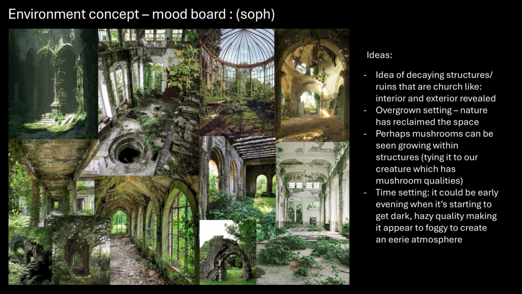
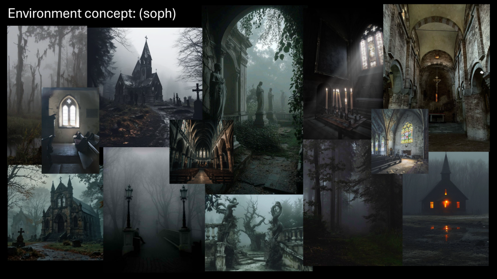
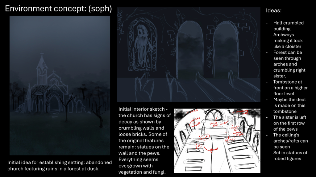
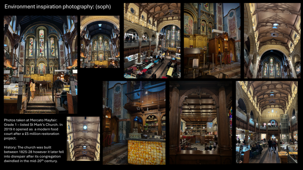
Using androgynous K-Pop idols as inspiration and creating a moodboard on Pinterest to contribute to the character design, I designed a character with long flowy green hair (murky green representing their environment, they’re like a forest nymph in a way), pale skin that looks almost inhuman, and an androgynous build, adding to their mysterious allure. Their features would seem almost serpent-like, alluding to the serpent in the tale of Adam and Eve, who tempts them into eating a forbidden fruit that ultimately banishes them from the Garden of Eden. I wasn’t too sure about their clothes , but I picked inspiration from a music video by a K-pop Group, in which one of the idols wore an outfit that reflected exactly what I was going for in my head. i changed the colour palette of the outfit to earthy tones to reflect their environment , which would be which we discussed would be an abandoned church in a forest clearing.
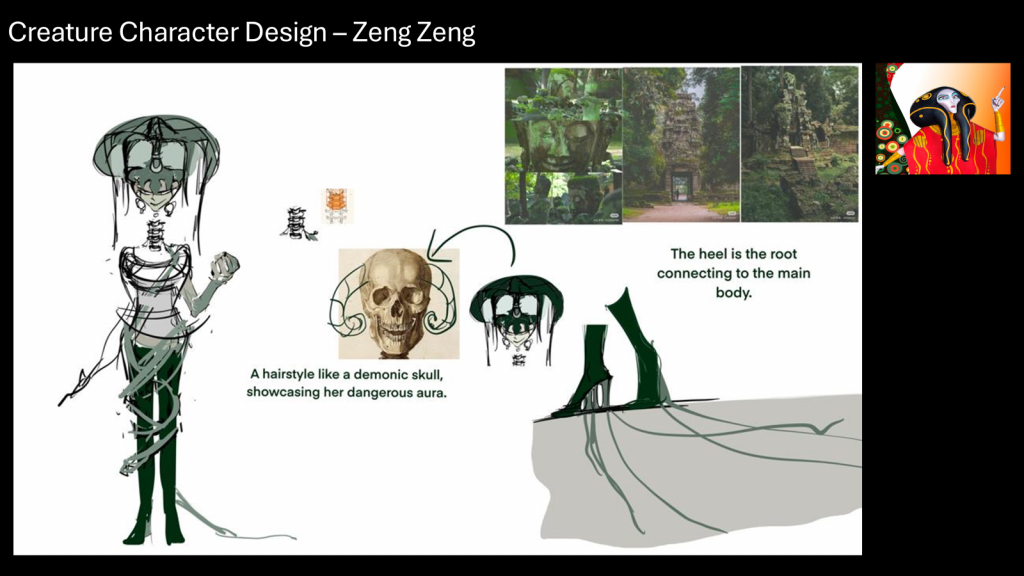
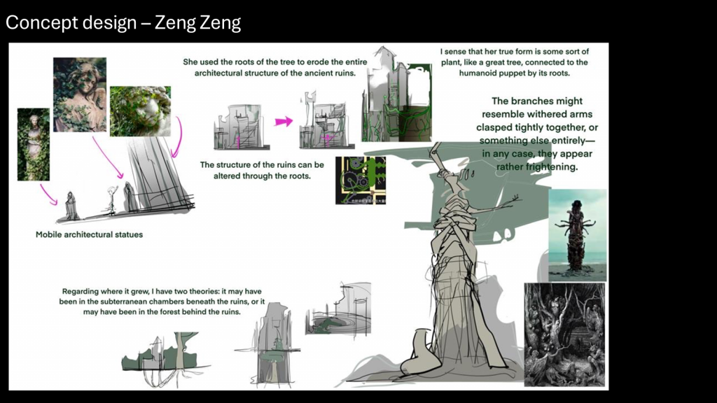
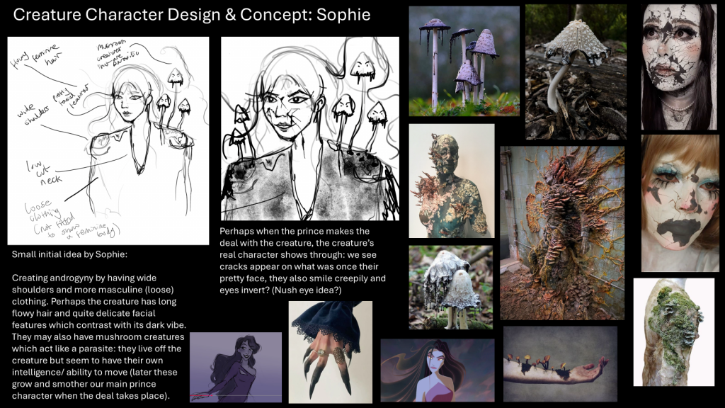
My idea ended up being rejected, and at the time I didn’t take it well and ended up developing slight imposter syndrome as I believed my work wasn’t good enough. Nevertheless, I grew to understand how I need to handle rejection and that it is not an insult to my own creativity. I really liked the idea that was devised by Zeng Zeng which depicted the creature as a monstrous representation of a mushroom (in a way signifying how she’s interspersed with the environment she grew up in).
These are the rest of the slides that my group ended up with by the end of Monday:
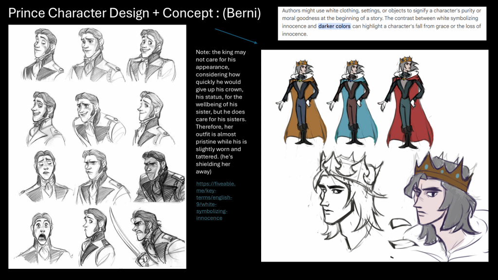
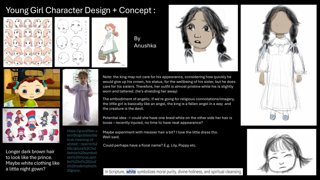
On Tuesday, we had decided that king must have more definitive reason in terms of why he would strike a deal with the creature, something that would bathe him in a more sympathetic light rather than make him into a villain. Therefore, a younger character was introduced, who was implied to be his younger sister. I was assigned to design the character of the younger sister, so I continued with the religious undertones and portrayed her as the symbol of innocence and purity, something that the prince/king would be fighting for. The idea was that she would be injured in an unknown battle that we did not discuss and that the prince or king would bring her to the creature to save her in exchange for his own life.
These are the rest of the slides that my group ended up with by the end of Tuesday:
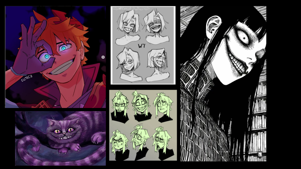
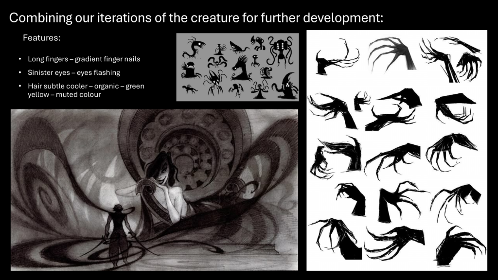
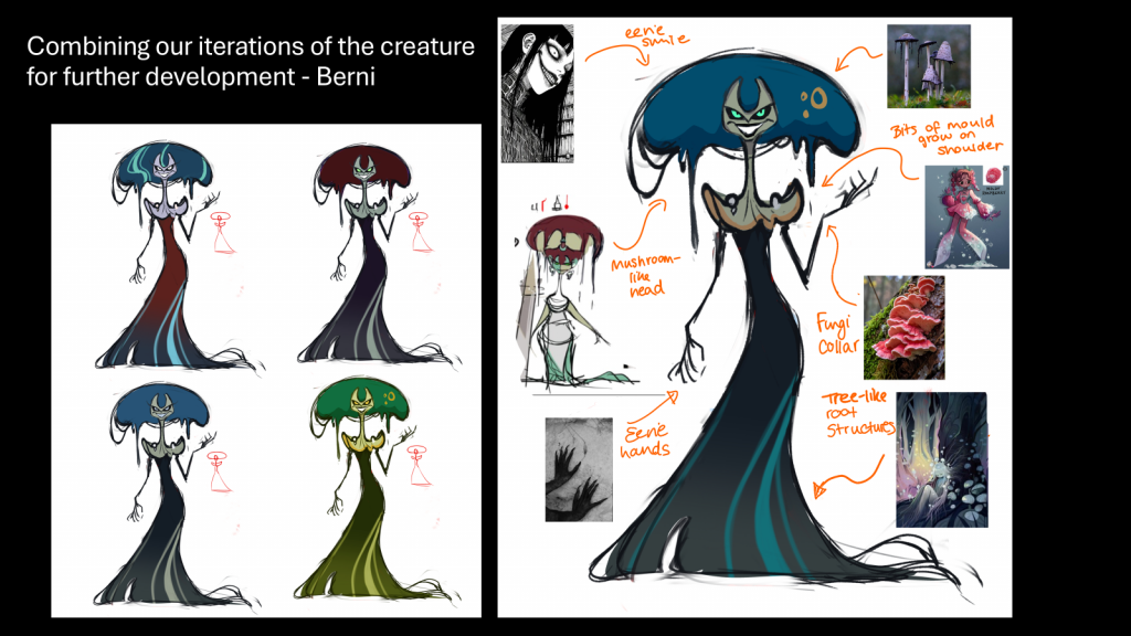
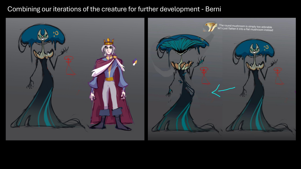
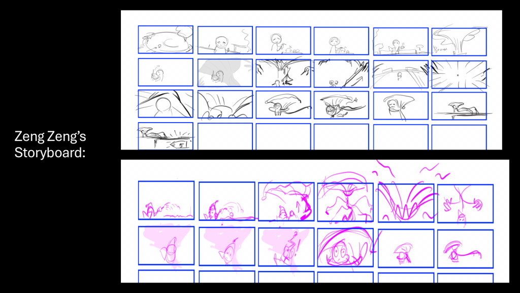
We also decided to combine the creature’s character designs that Zeng Zeng, Sophie and I created, with the results made by Berni and Zeng Zeng shown below:
PLEASE NOTE: Zeng Zeng created the design and adjustment to the creature above. The creature’s appearance in the middle is what we end up using as her design in our current animation.
On Wednesday, we brainstormed more ideas for the animatic and began storyboarding on sticky notes whilst also noting down roles in typical animation productions and how we could apply them to our project.
When we received feedback on Friday , we were told that the premise was overdone and generic, something that I definitely agreed with and understood. Moreover, the story didn’t progress in an arc that reached a crescendo in any way, and it felt more like an excerpt from a movie. Therefore, we had to scramble and brainstorm other ideas.
I was very interested in exploring subversive personalities; how the prince or king could be characterized negatively and the creature could be painted in a much more sympathetic light. however, some people in our group derailed to a point that it became a self-indulgent romance rather than a gritty story. Therefore, we realized that our brains were too saturated to come up with any new ideas and we took a break during the weekend to reconvene with a clearer mind on Monday.
WEEK 2 (01/12/25-05/12/25):
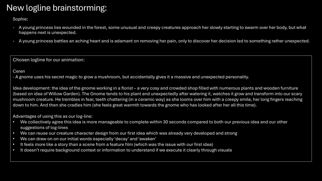
On Monday, we all sat down and discussed possible loglines for our animation since the original idea was rightfully rejected.
We ended up choosing Ceren’s idea because of its originality, simplicity and the possibilities it had visually. Moreover, we needed to let go of the original idea no matter how difficult it was to do so, and choosing to work with something new definitely helped in the long run, as it ended up becoming the plot for the final animation after a few tweaks.
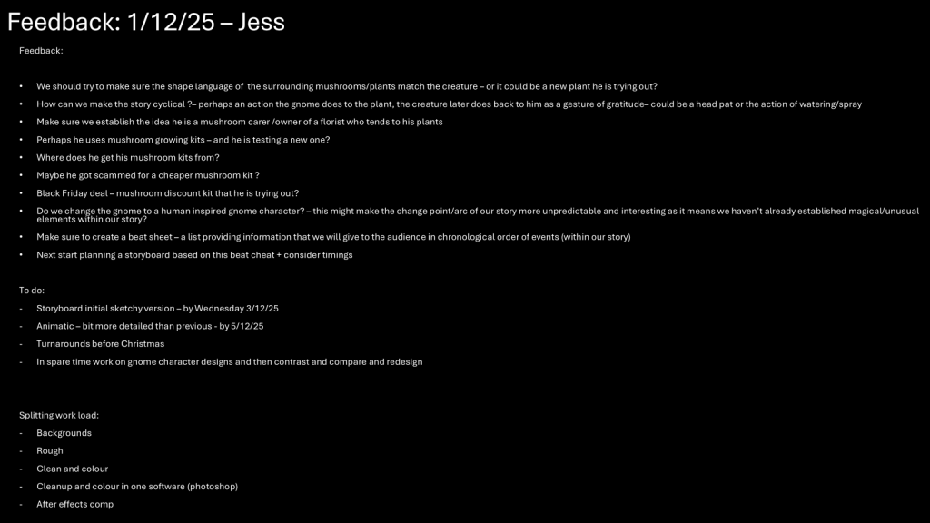
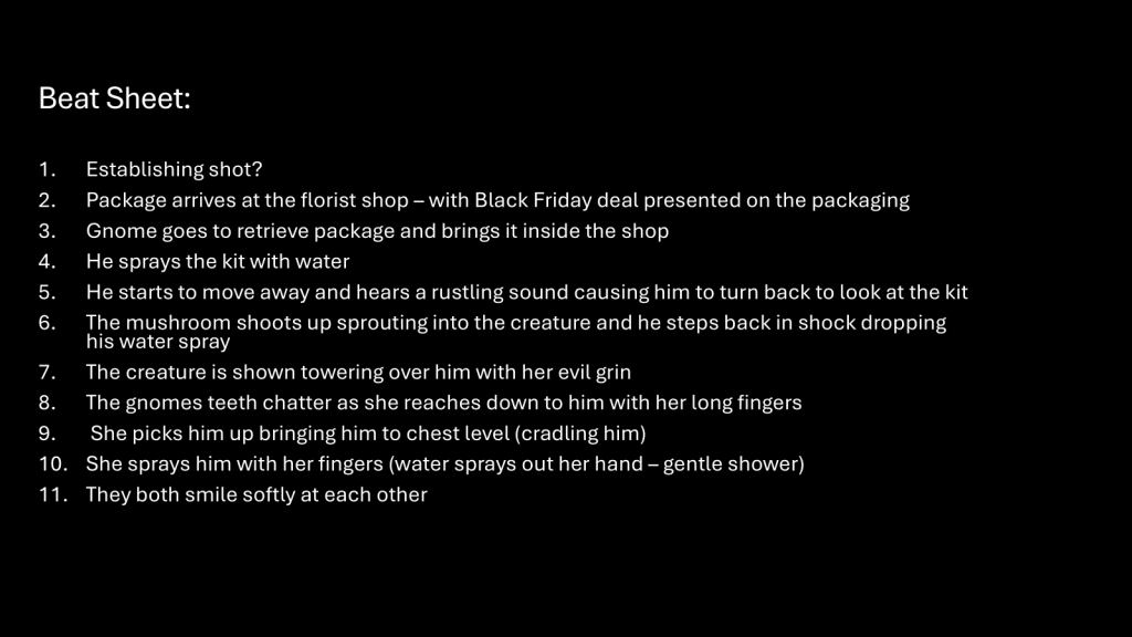
We were given feedback by Jess which included creating a beat sheet that would outline a chronology of events within our story.
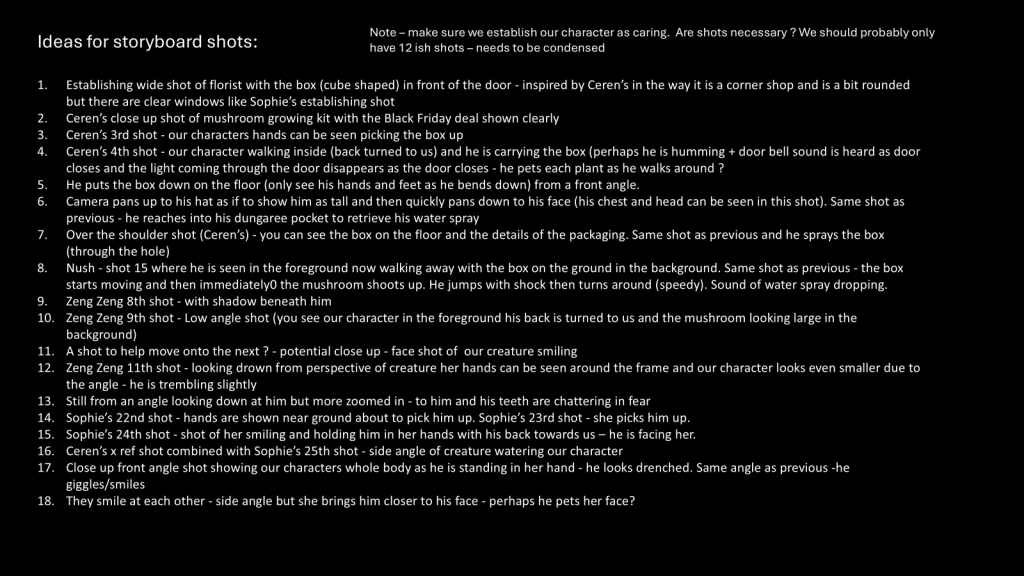
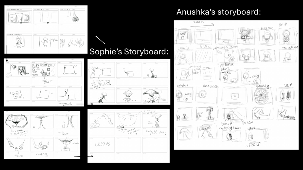
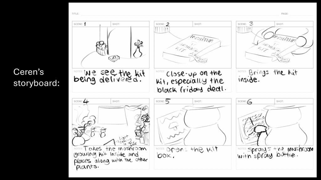
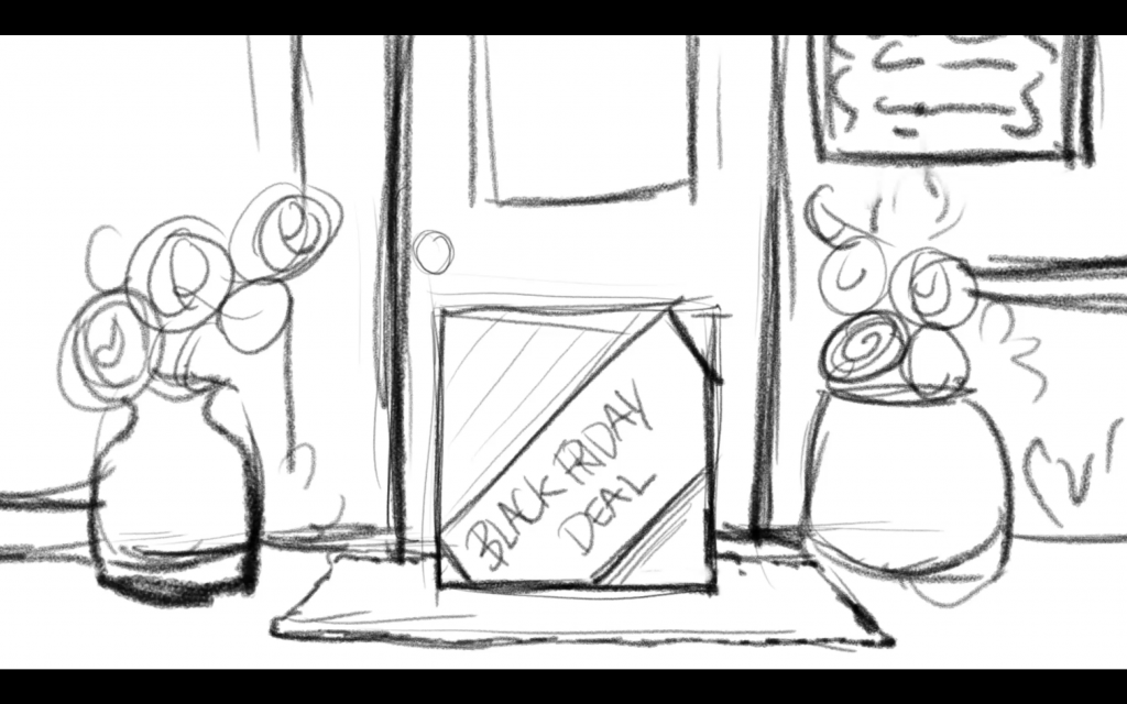
On Wednesday, we brainstormed ideas and created our own storyboards from our beat sheet, combining them into one before sending them to Berni to compile into an animatic.
The original beat sheet
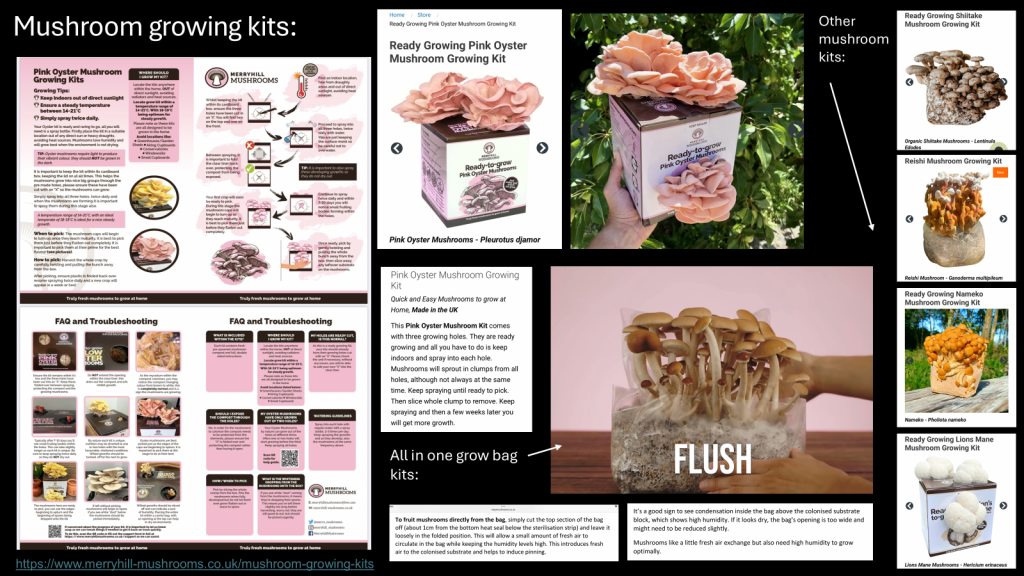
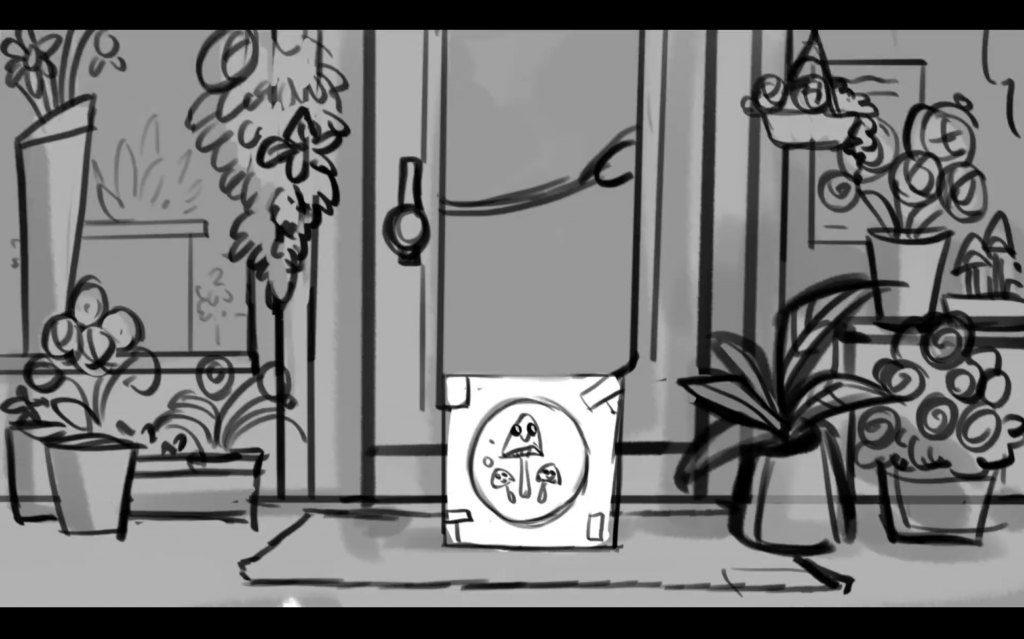
We also researched mushroom growing kits to portray them more accurately in our animation.
Mushroom growing kit research by Sophie
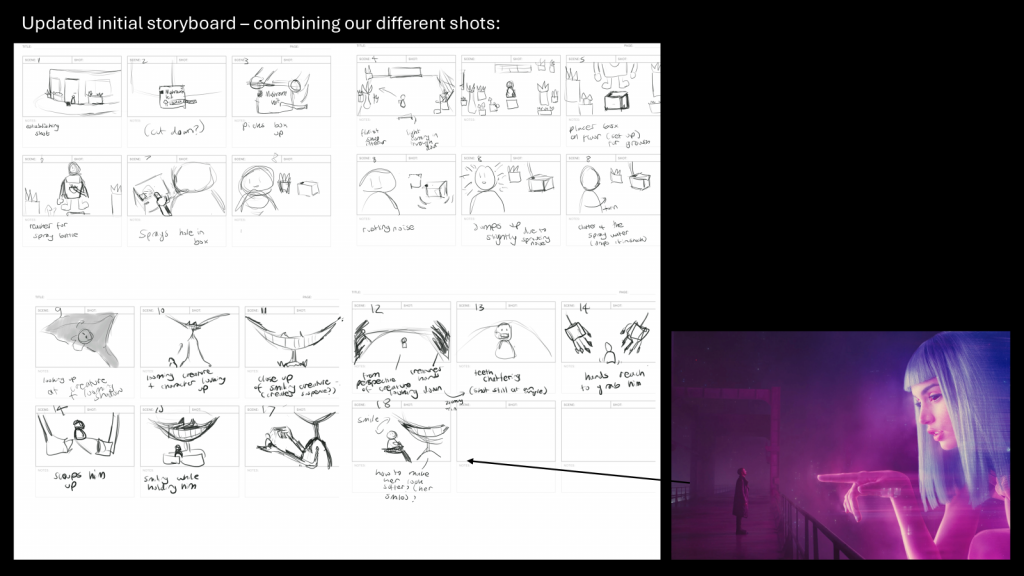
We were told our original beat sheet contained far too many scenes, and that they must be condensed in order to fit the 30 second timeframe. After discussing what needed to be done, we ended up with 11 scenes of content, a big improvement from the whopping 17 scenes we initially had.
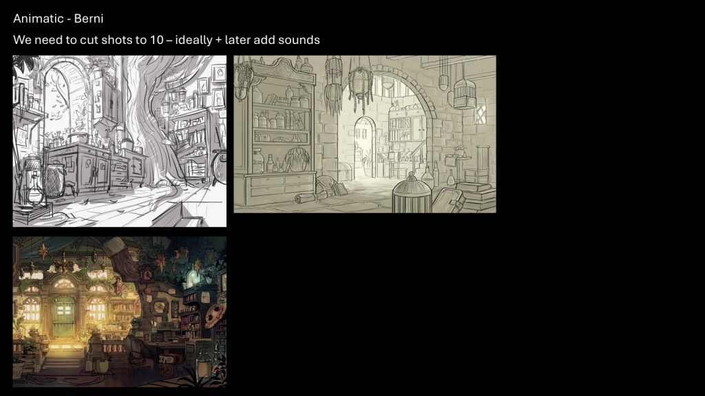
Rough animatic by Berni. Click the photo above to be redirected to Padlet.
On Friday, we showed the animatic to Jess, who gave us feedback accordingly.
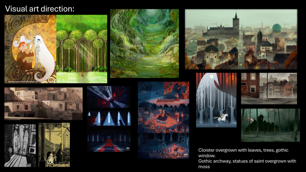
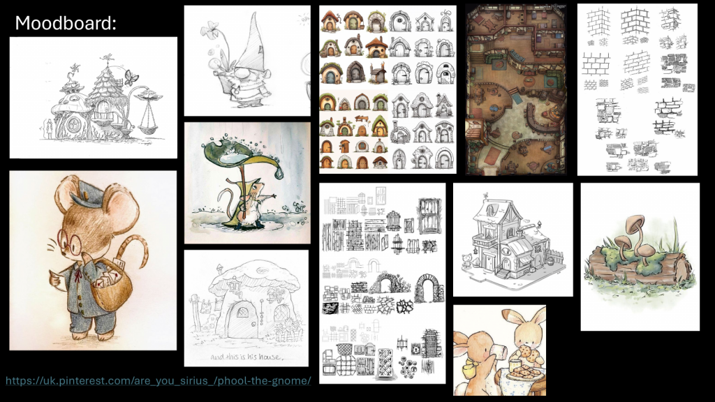
Afterwards, we discussed the artstyle and art direction of the animation, as shown below. I created a moodboard for Phool (our gnome’s name) to brainstorm his artstyle and possible design for his florist. I was highly inspired by children’s picture-books and their sketch-like texture using pencil/colour pencil.
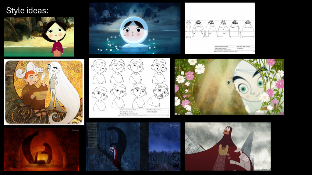
For the background and art direction, we settled for a style reminiscent of Cartoon Saloon, as shown below:
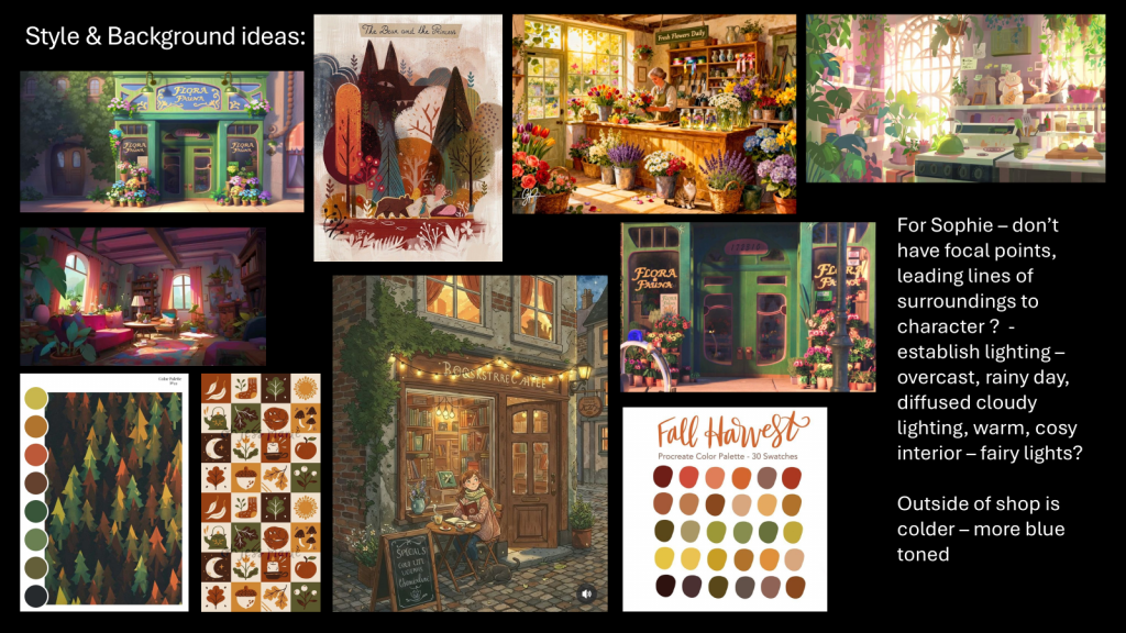
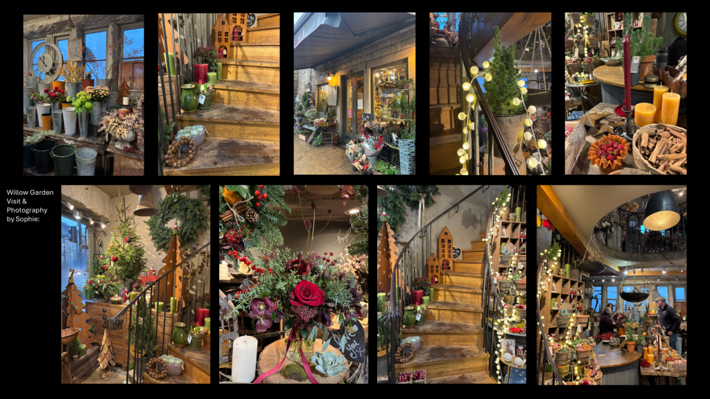
Background concepts created by Sophie, who also used a shop she visited as inspiration.
It was slightly confusing whether we were going to combine the cartoon saloon background with the picture-book artstyle, and no clarification was given until after we designed Phool.
WEEK 3 (08/12/25-12/12/25):
Berni had finished the animatic by Monday, and we discussed character design and colour palette.
Animatic by Berni. Click the photo above to be redirected to Padlet.
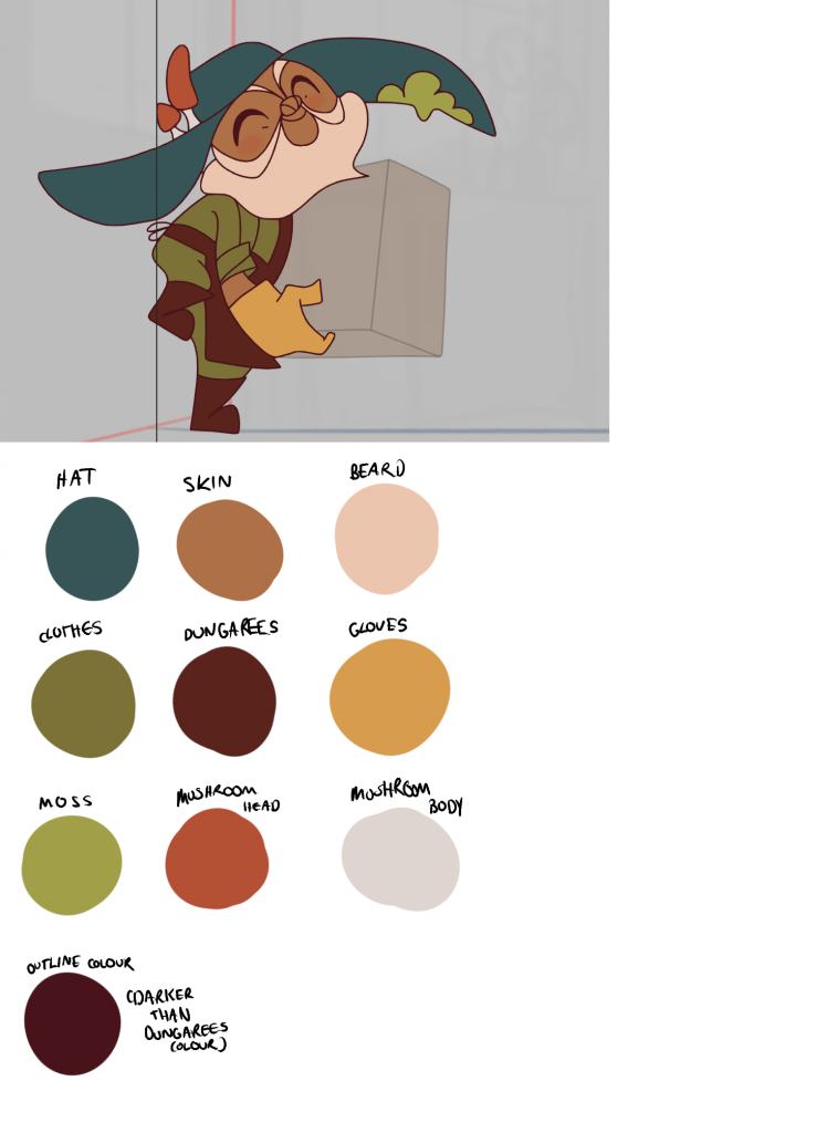
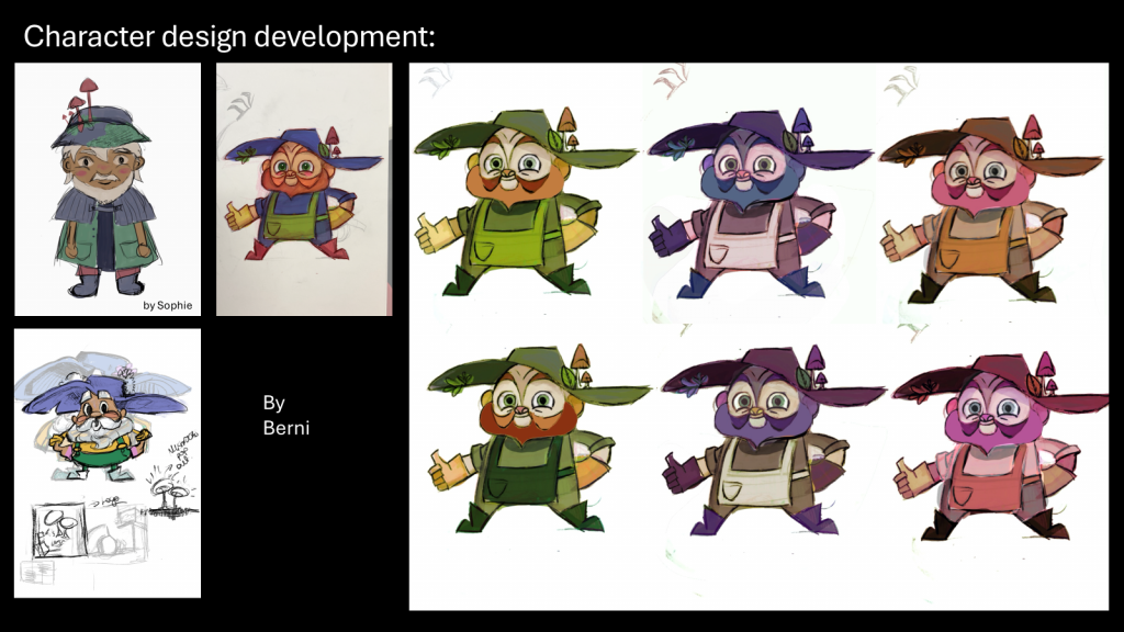
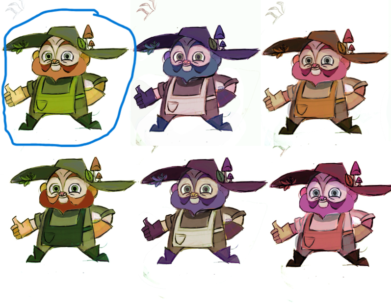
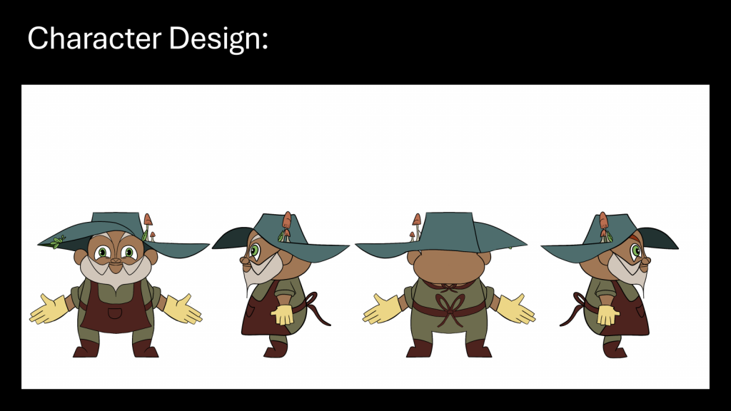
I was given the task to create a character turnaround with the palette shown on the top left (circled below). This was the colour scheme we decided on, except Phool’s skin tone would be darker since he is meant to be South Asian (the name ‘Phool’ means flower in Hindi).
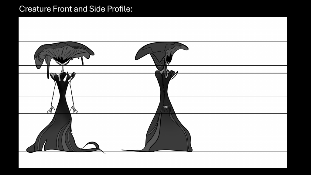
I also made a character turnaround for the creature, as shown below:
I didn’t add any colour as per what we discussed.
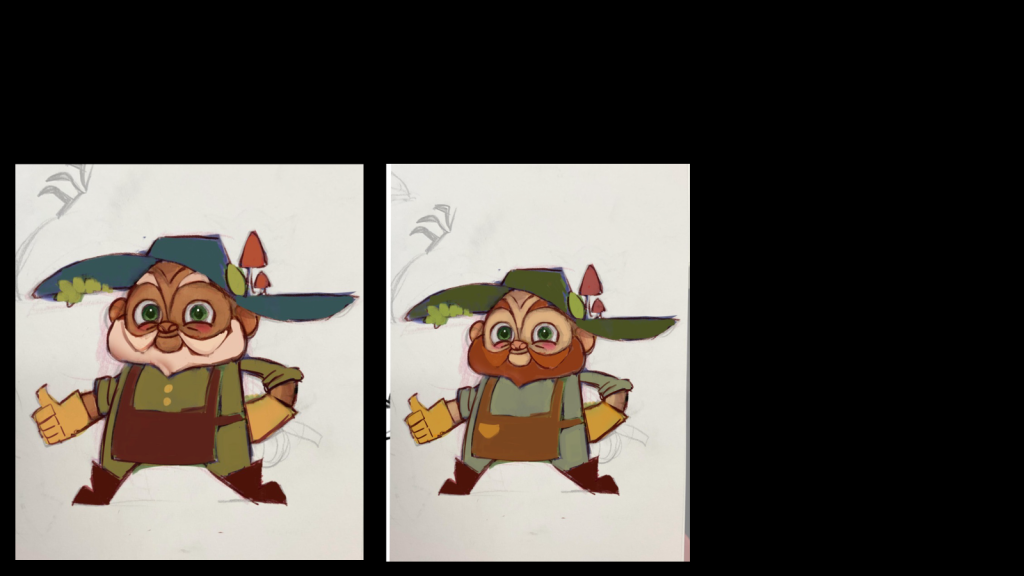
On Wednesday, I was told to change Phool’s colour palette, and although I wasn’t given the task to do so, I implemented the new palette onto his turnaround.
Redesign ideas by Berni
Revised character sheet by me
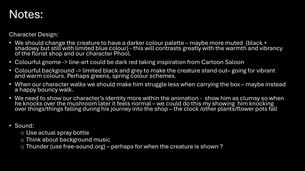
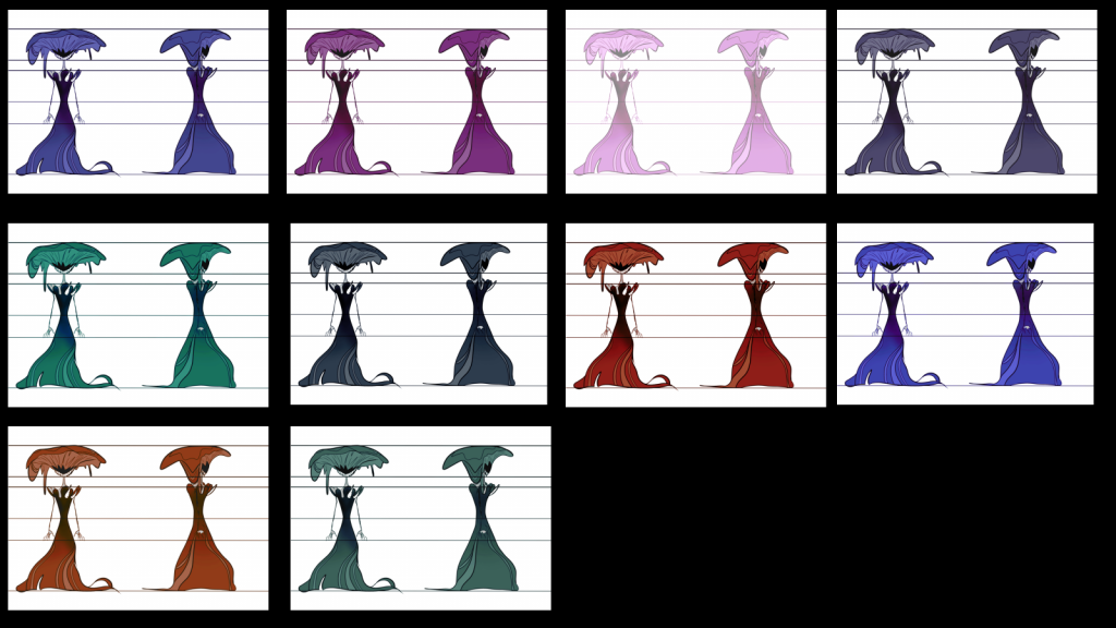
The greyscale design for the creature that we decided on Monday was also suddenly rejected, and Ceren was given the task of creating variations of the creature’s colour scheme so that we could then decide what looked best.
These ended up being for naught, and we eventually chose the original colour scheme that Zeng Zeng used for the scrapped bargain deal idea (although this was decided quite late in the production process).
I was also given the role to provide sound for the animation, and I ended up using Foley to create most of the sound effects. For example, Phool shivering in fear was created by rattling a soap bottle that was half opened. I then added other sound effects from free-sound for actions such as the mushroom growing (applying a sound effect I previously used for the Intro to Animation project).
PLEASE NOTE: Increasing the volume is advised for a better viewing experience.
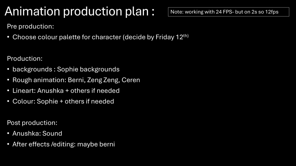
We ended up deciding roles for the production stage, as shown below:
REFLECTION:
I did like the pre-production process, and it was very fun getting to know everyone and understanding their skillset at the time to see what roles would be best suited. I liked how we all unanimously agreed on our original idea and set to work on it immediately, then getting feedback for it on Friday that same week. We all worked efficiently and harmoniously, and whilst the idea being rejected was difficult, most of us bounced back and went with a new, more original idea that we could then expand upon without feeling like it would be too cliché. The fact that we were resilient throughout the entire process was honestly very impressive, and I’m so glad we persevered and got through every single checkpoint before the holidays.
However, miscommunication began around this stage of the project. A leader/director seemed to have been instinctively established from the beginning without us formally agreeing on any roles. The power shift was subtle initially, but progressively intensified and boiled over during the production stage.
The last week before the holidays was a very difficult time for me, as it wasn’t easy trying to balance my own creative output with the high expectations and standards that some team members had. I sought validation, which was why I was so disheartened when the first rejection occurred early on in the project. Moreover, during the last week I constantly felt that I wasn’t good enough despite how hard I was trying. In hindsight I was trying my best, but I was basing my talent on other people’s perceptions when in fact it shouldn’t be that way. The holidays helped me rejuvenate and gain the self confidence that I lost previously, enabling me to contribute to the project with a clearer mindset.